Works.
Boring and obvious beats original and clever.
I simplify complex software
Dozens of parameters, expert users, hardware that pushes back. The job is deciding what goes on the one screen that matters — and leaving everything else out of the way.
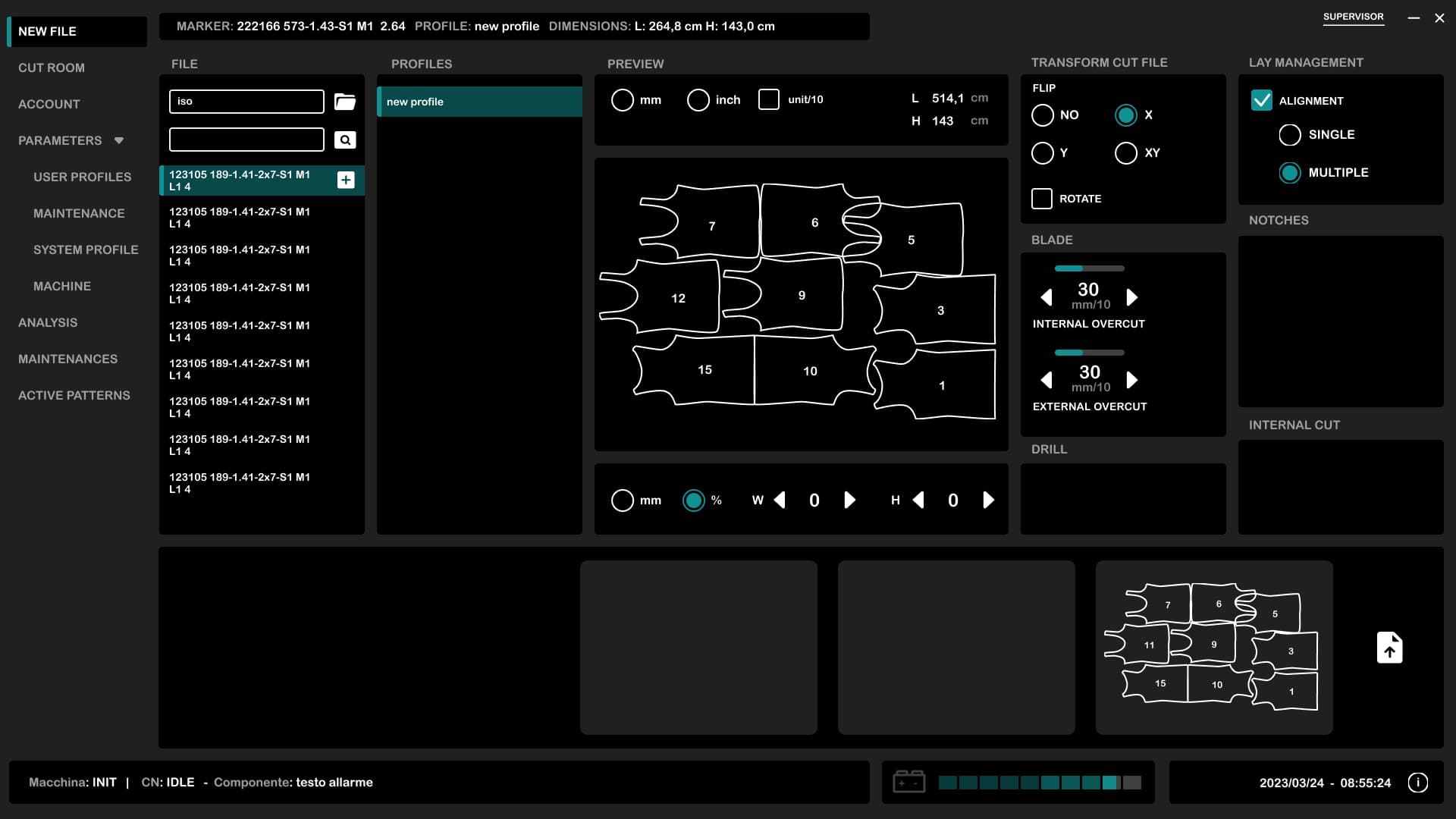
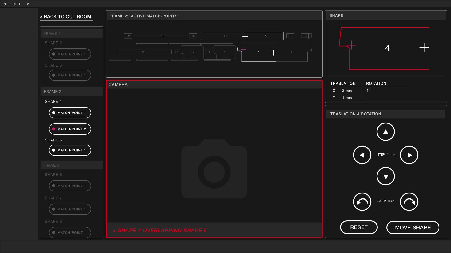
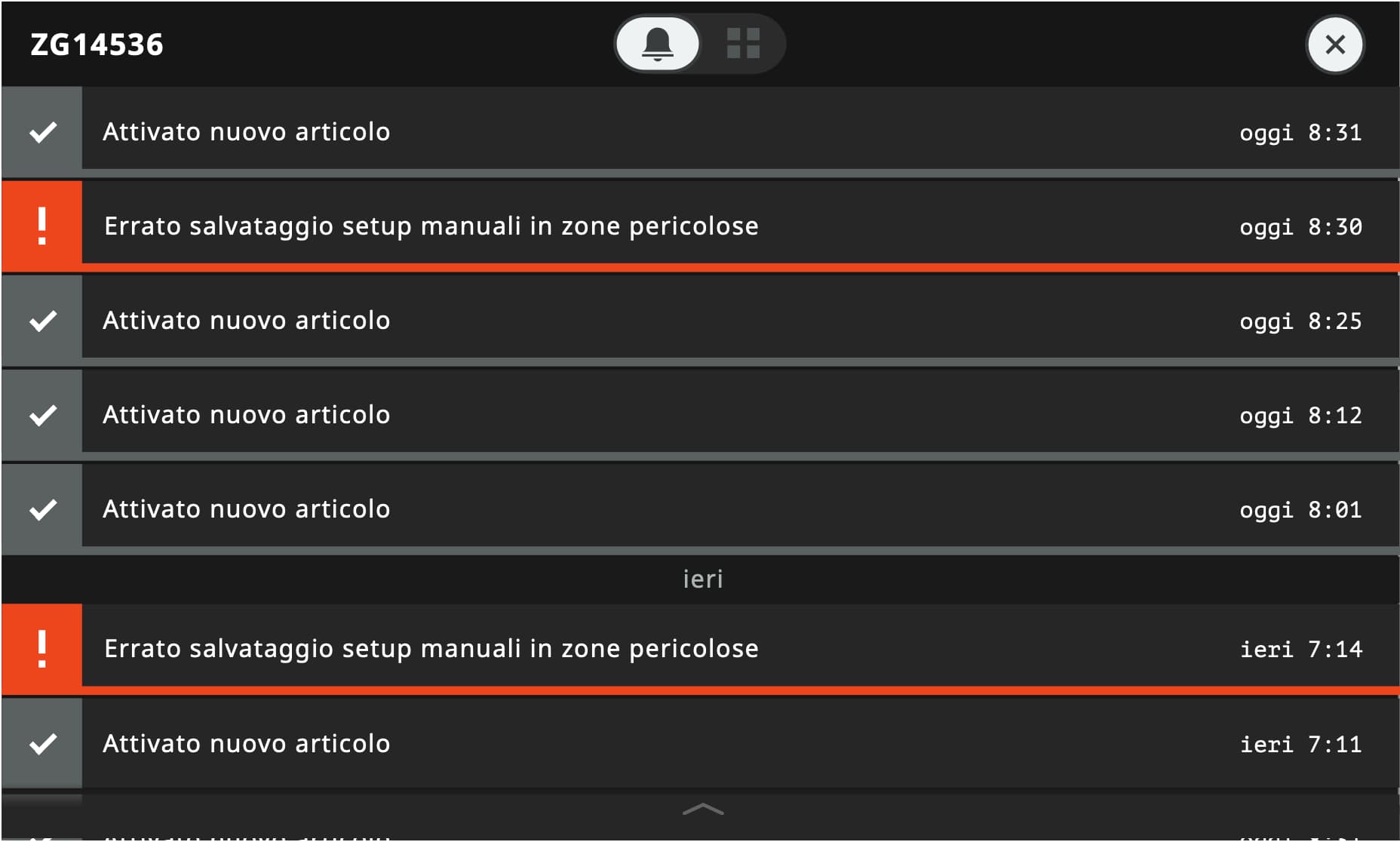
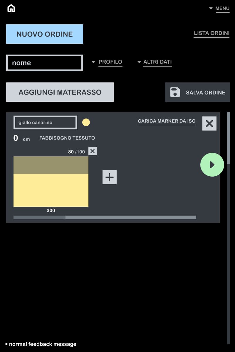
Next2 — automatic fabric cutter
Cockpit logic: almost no navigation, and far fewer errors on the console.
4 images — scroll or use ← →
- Product
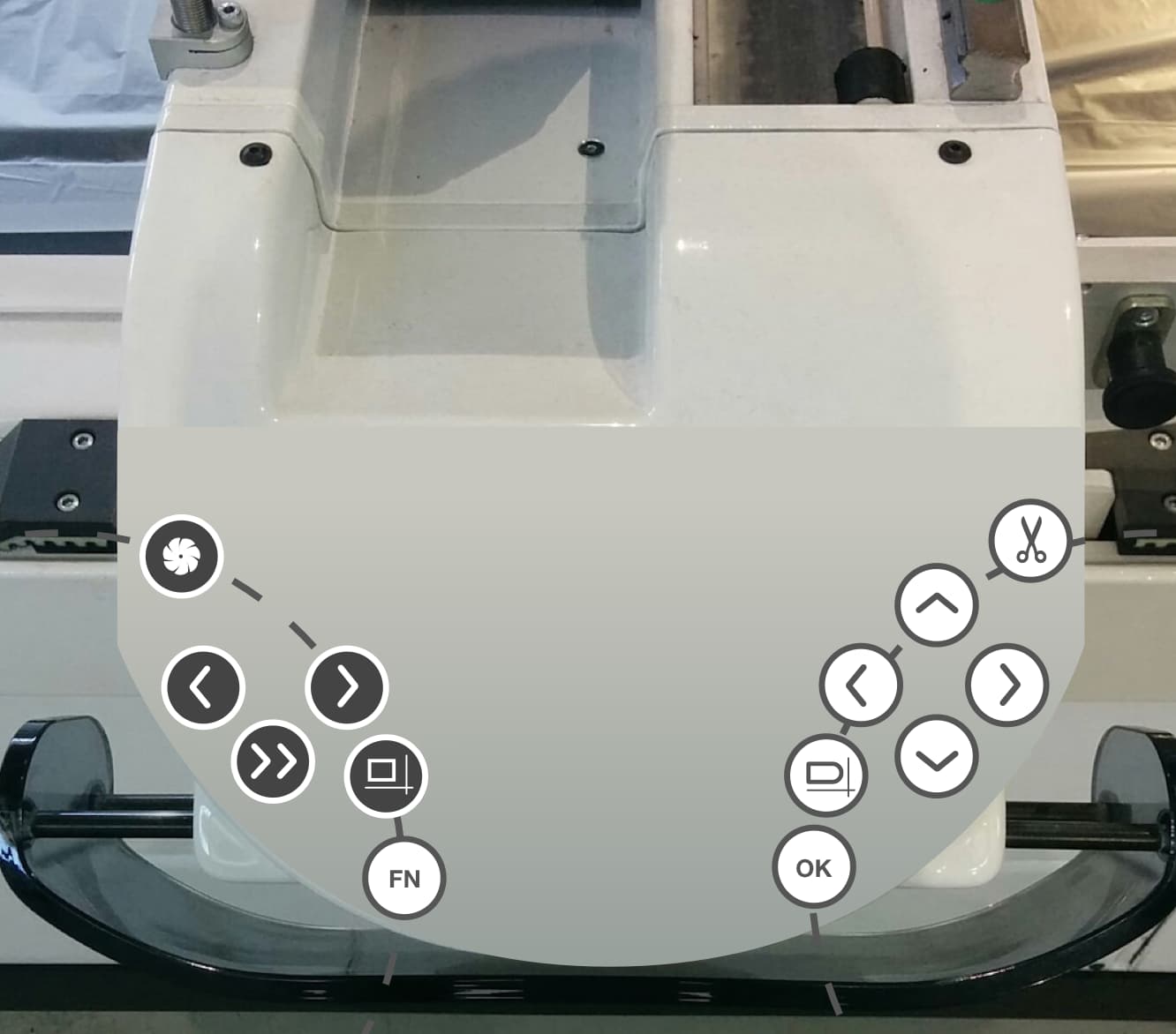
- Cut room software for an automatic fabric cutter, plus the physical console that drives the cutting head. Used by factory operators, most of them not at ease with a PC.
- Complexity
- Between 50 and 100 parameters, a long multi-step workflow, hardware constraints inherited from the previous machine. Everything had to be redesigned from scratch without breaking what the plant already did.
- Immersion
- Six months of factory visits, watching operators on the old machine before drawing a single screen.
- Made obvious
- Cockpit logic: almost no navigation, no controls hidden in menus, labels in the operators' own jargon, targets sized for a working hand. The console separates left-hand and right-hand commands so the body remembers what the mind used to.
- Result
- In production. No numbers from the client, but the feedback was direct: far fewer errors on the console, "much more ergonomic".
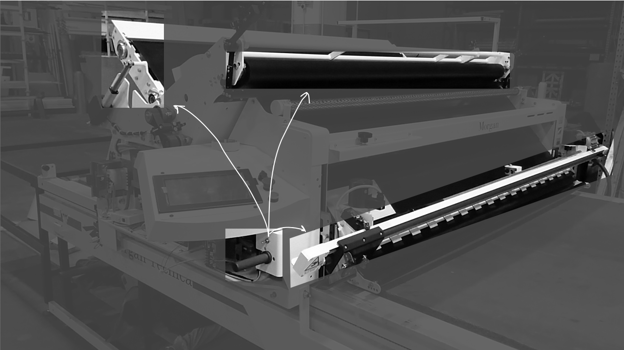
Fox — automatic fabric spreader, two generations
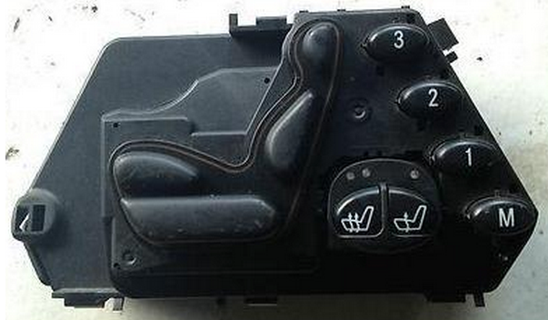
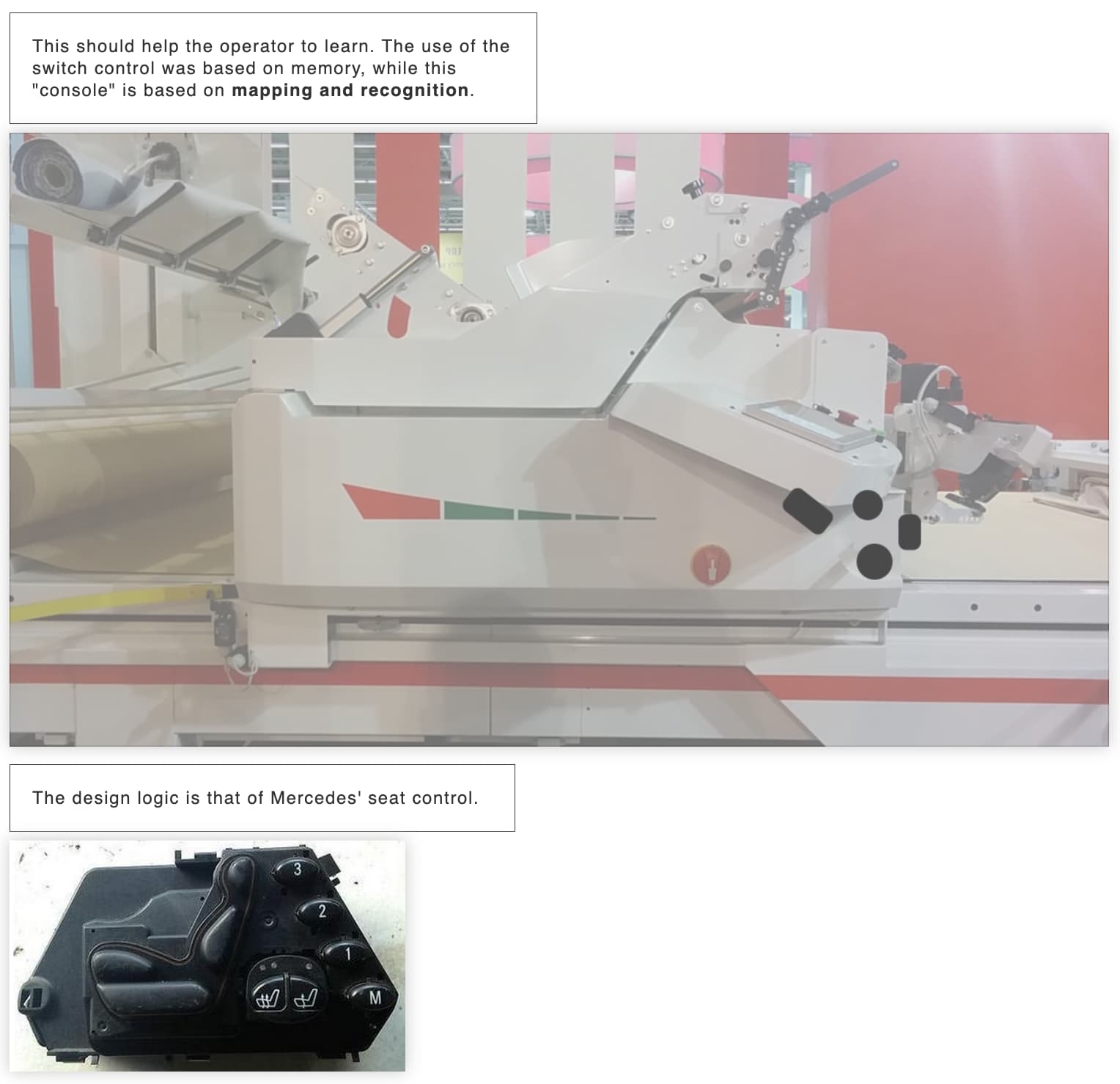
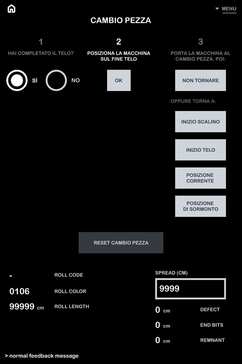
A console mapped on the machine body, the way a car seat control is.
10 images — scroll or use ← →
- Product
- Spreader that unrolls fabric rolls into lays for cutting. Fox 2 is the mechanical and software update of Fox 1, not a rewrite.
- Complexity
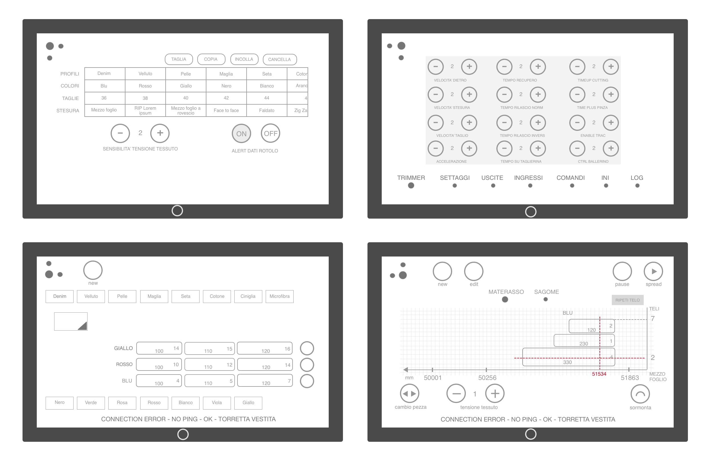
- Manual mode ran on a switch plus a handle: modal, sequence-based, memorised. Errors were frequent enough that operators avoided it altogether. Data entry went through a virtual keyboard nobody wanted to use.
- Immersion
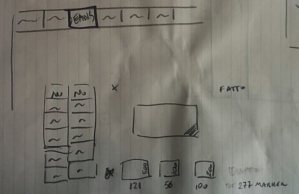
- Six months on the factory floor for the first generation. The spreading UI was then redesigned three times over five years, as the machine evolved.
- Made obvious
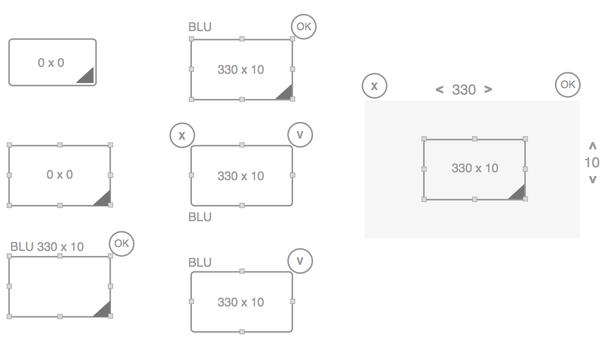
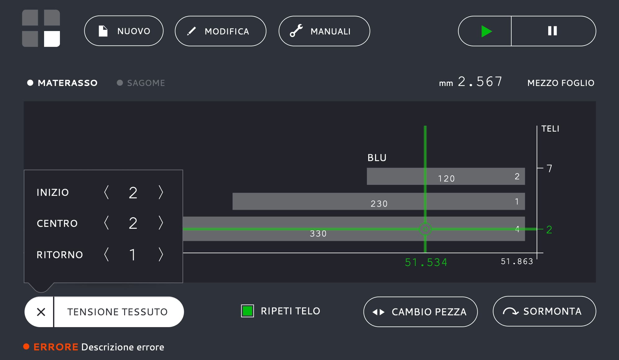
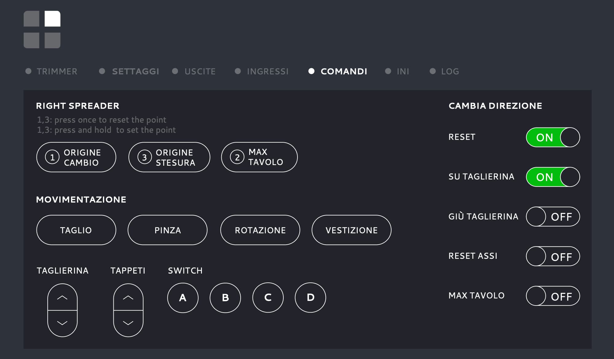
- The console works like a car seat control: one button per motor, laid out as a map of the machine, so the operator recognises instead of recalling. On screen, numbers are entered by finger, not by keyboard; roll change is three numbered steps.
- Result
- Both generations in production. The console was the turning point: fewer errors, and operators started trusting the manual commands again.
Ply1 — single-ply cutter
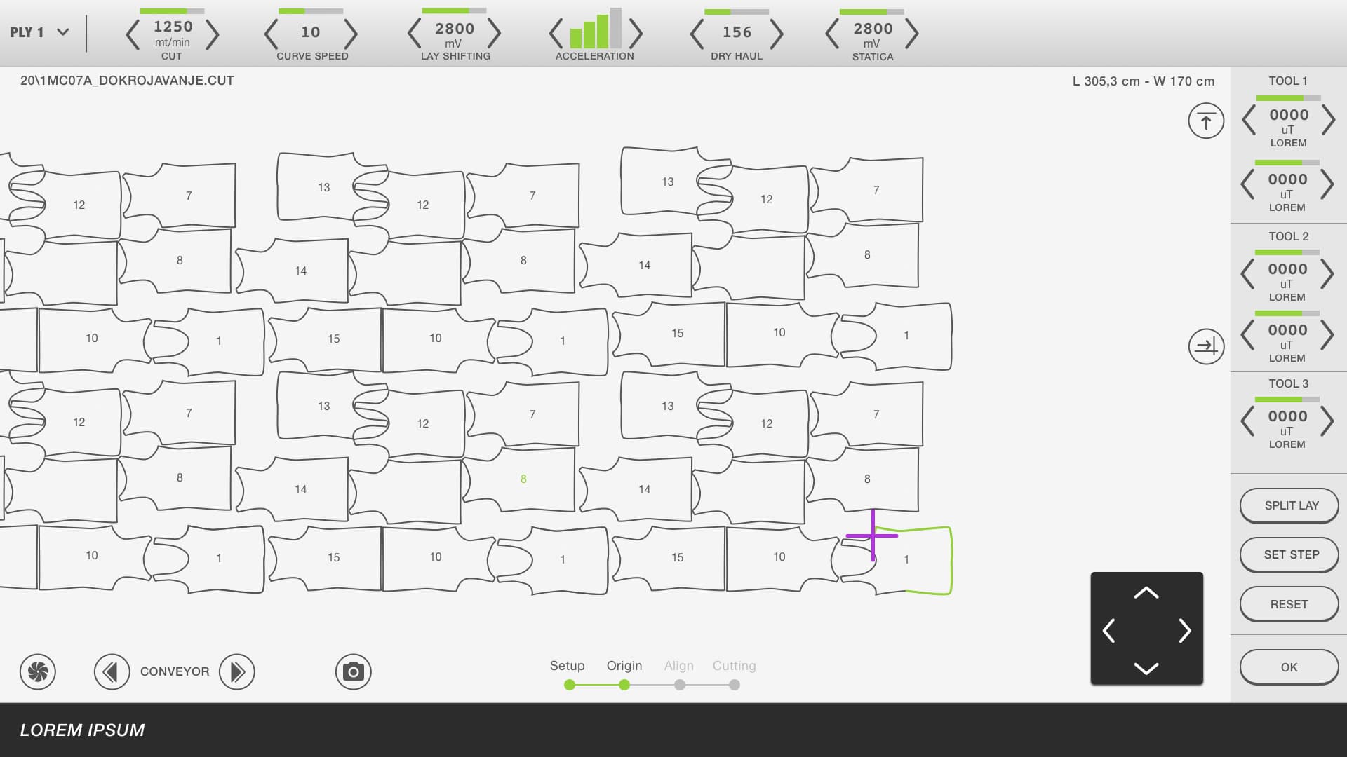
The whole machine on one screen, with no navigation at all.
- Product
- Single-ply cutter with linear motors, a new machine for the client. The interface had to feel as new as the mechanics.
- Complexity
- Dozens of nested pieces, cutting parameters, three tools, camera, conveyor — all live, all on one touch surface.
- Immersion
- Built on the Next2 work: same plant, same operators, same six months of observation behind it.
- Made obvious
- The cockpit idea taken to its limit: no navigation at all. One screen, the marker in the middle, everything else at the edges. Light background to tell it apart from the multi-ply line at a glance.
- Result
- In production.
Twist — fabric spreader
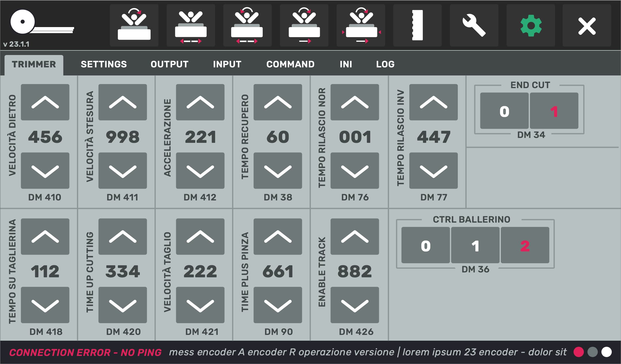
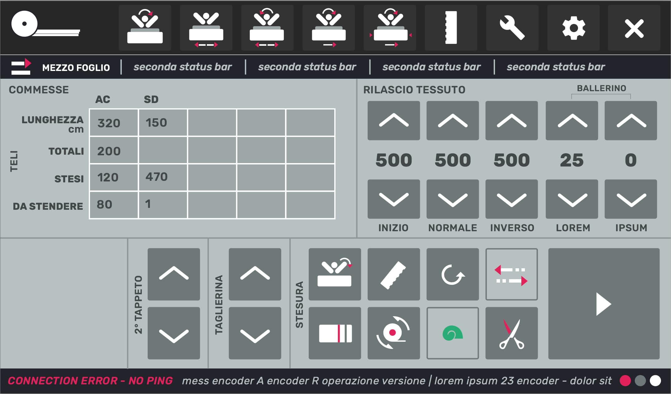
Oversized arrows and values: one glance, one tap.
2 images — scroll or use ← →
- Product
- Another spreader model: same job as Fox, different machine.
- Complexity
- A hard requirement: the PLC register number (DM) of every parameter had to stay visible for technicians. Usability for operators and traceability for technicians on the same screen.
- Immersion
- Same client, same factory floor as Fox: the second of three spreading UIs I designed for them.
- Made obvious
- Oversized arrows and values: one glance, one tap. Register numbers kept, but pushed under each control where only those who look for them see them.
- Result
- In production, fewer input errors.
Sock knitting machine
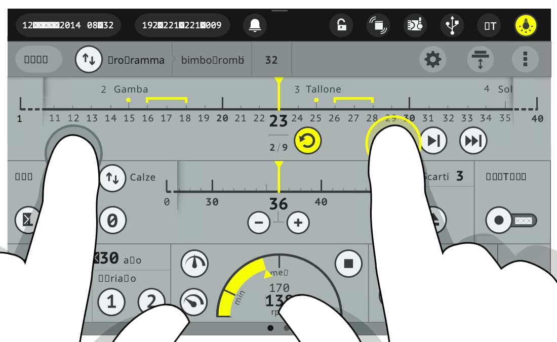
Far fewer screens, and the sock's progress readable across the room.
5 images — scroll or use ← →
- Product
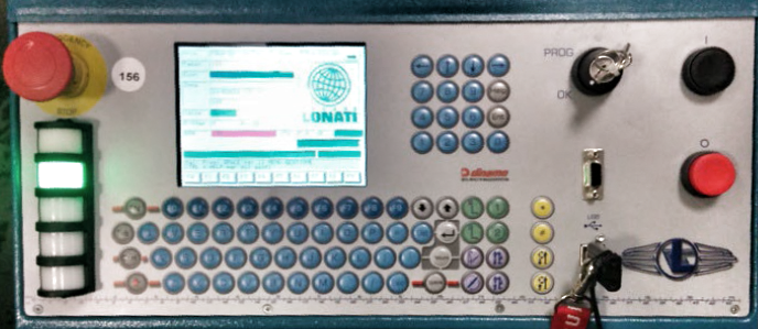
- Control panel of an industrial sock knitting machine.
- Complexity
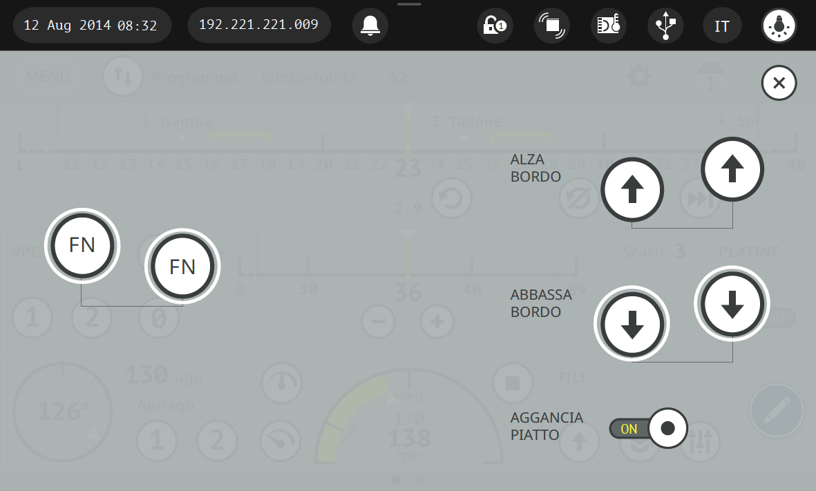
- The previous UI was windows and menus from the '80s. The whole interaction paradigm had to change, for operators who had used the old one for years, under neon lights that wash out any screen. Some operations are dangerous and must need both hands.
- Immersion
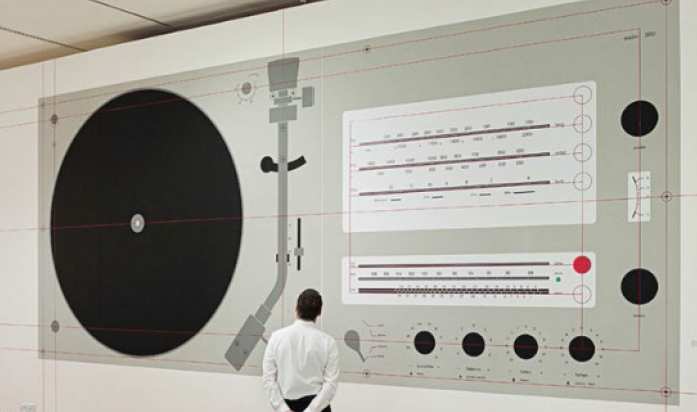
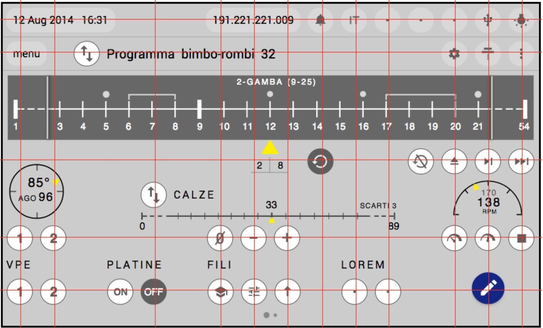
- Time on the machine and on the old software, mapping which of its screens were actually used. Dieter Rams' Braun layouts as the reference for aligning controls.
- Made obvious
- Far fewer screens. Production data live on the main view instead of buried in status bars. The sock's progress — leg, heel, sole — as a timeline you can read from across the room. Two-hand safety on the touchscreen itself, not on a button somewhere else. Every state of every control designed for glare.
- Result
- Presented at the trade fair, went into production.
Mediaddress — media relations platform
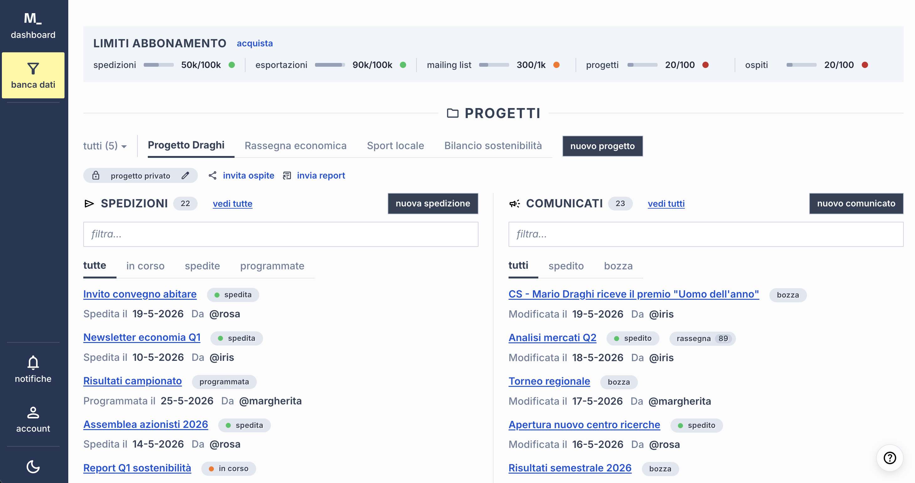
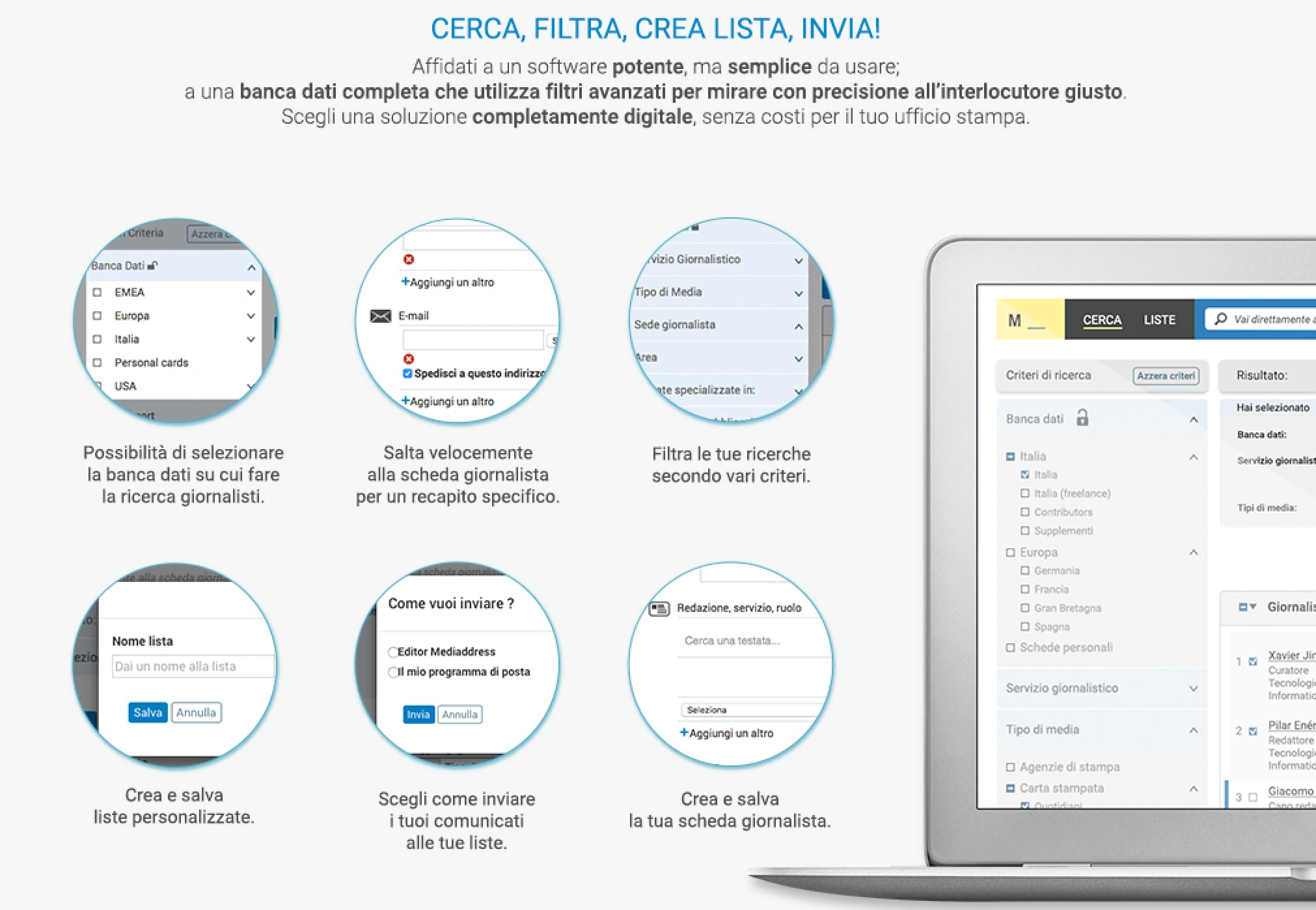
Nine tasks out of nine completed, against five give-ups on the old design.
4 images — scroll or use ← →
- Product
- The largest Italian media relations platform. Press offices search for journalists, build lists, and send releases to them.
- Complexity
- Not the number of filters. The hard part is that what people describe in interviews often cannot be asked of the database at all, because the metadata is not there. And sending to a list is its own long flow of options.
- Immersion
- Countless interviews and usability tests. I designed this software twice, ten years apart.
- Made obvious
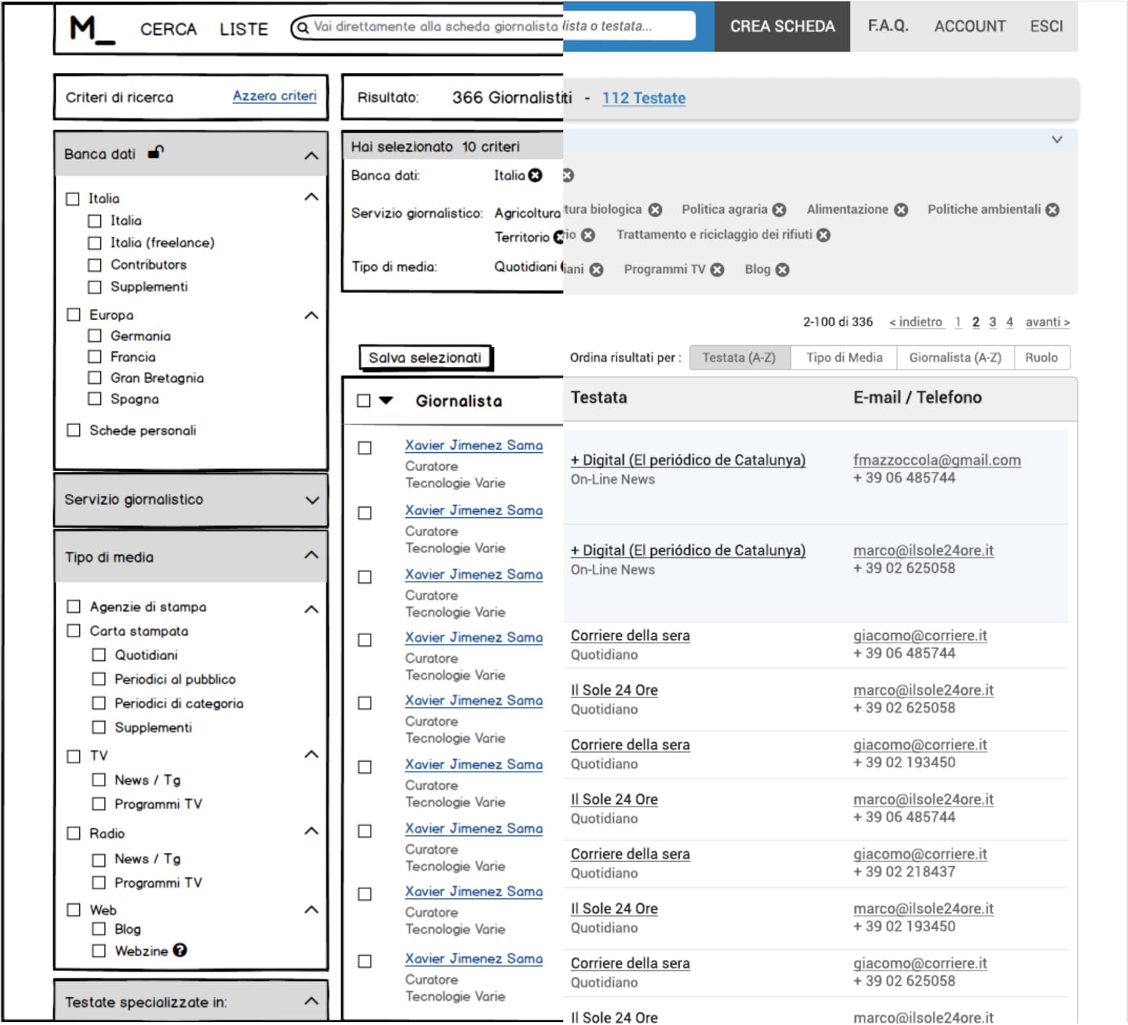
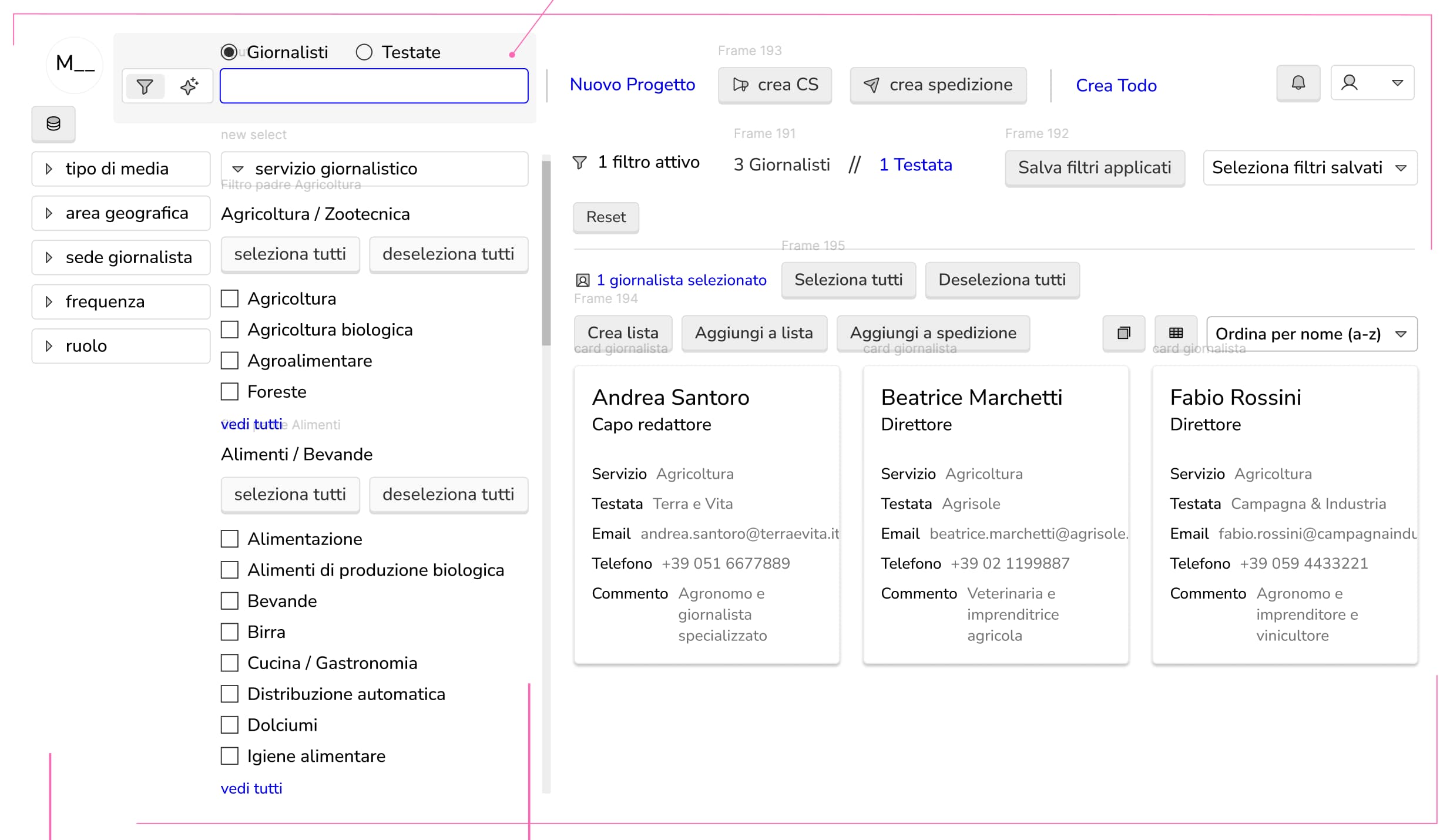
- Filters shaped around what people are trying to achieve, not around the database schema. Results as journalist cards you can read, instead of rows in a table.
- Result
- A randomised test, two groups of three first-time users, three tasks each. On the new design all nine tasks were completed (averages 27", 2'58", 2'34"). On the old one, five of the nine ended with the user giving up.
Prototype: dashboard ↗ · Prototype: AI service ↗ · Mediaddress ↗
Mastermind — cutting room optimiser
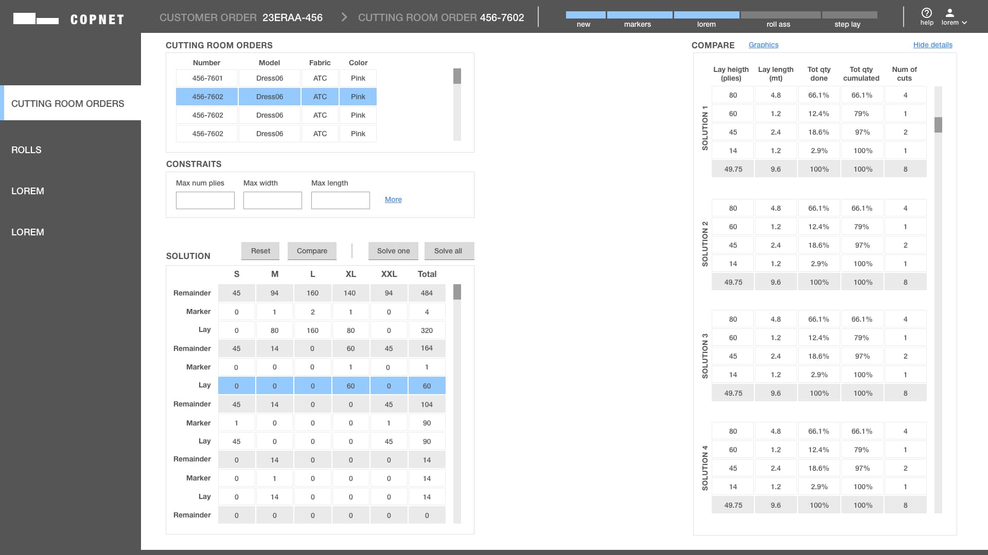
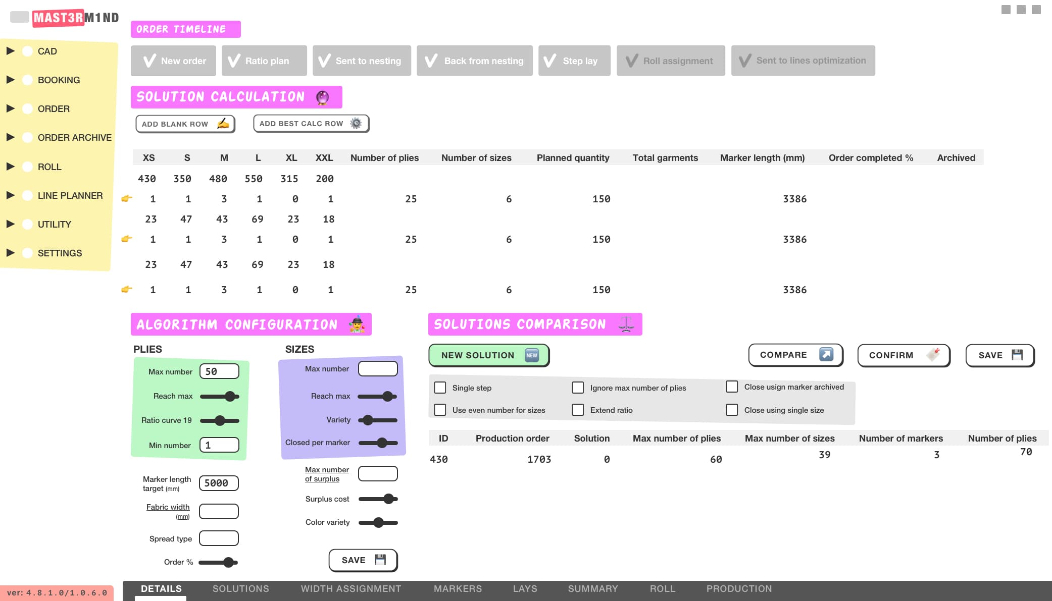
The order as a timeline across the top, solutions side by side.
2 images — scroll or use ← →
- Product
- Sales orders for a clothing line go in. The cutting and spreading plan comes out, optimised for fabric and time. Used by the production team of a garment manufacturer.
- Complexity
- An optimisation algorithm with dozens of parameters. People have to set it, read what it produced, and compare one solution against another before committing real fabric.
- Made obvious
- The order as a timeline across the top, so you always know which step you are in. Solutions side by side, with only the numbers that decide between them.
2D pattern CAD — desktop restyling
A restyling, not a redesign: icons and panels stop competing for attention.
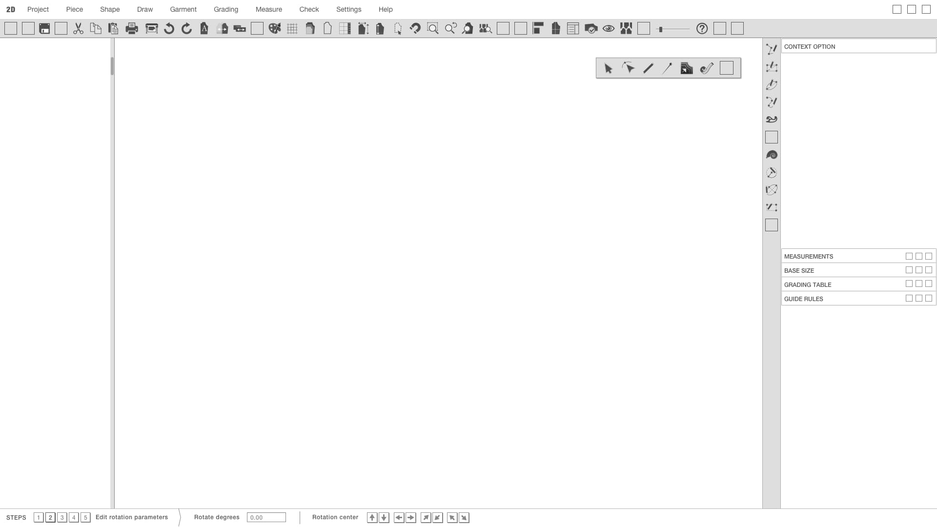
- Product
- 2D CAD for garment patterns: draw, grade, measure, check.
- Complexity
- A native Windows application with decades of accumulated features, and users who know exactly where each one lives. The structure could not move.
- Made obvious
- A restyling, not a redesign: same structure, clearer surface, icons and panels that stop competing for attention.
2D pattern CAD — web app, from scratch
Direct manipulation on the canvas; buttons and menus almost disappear.
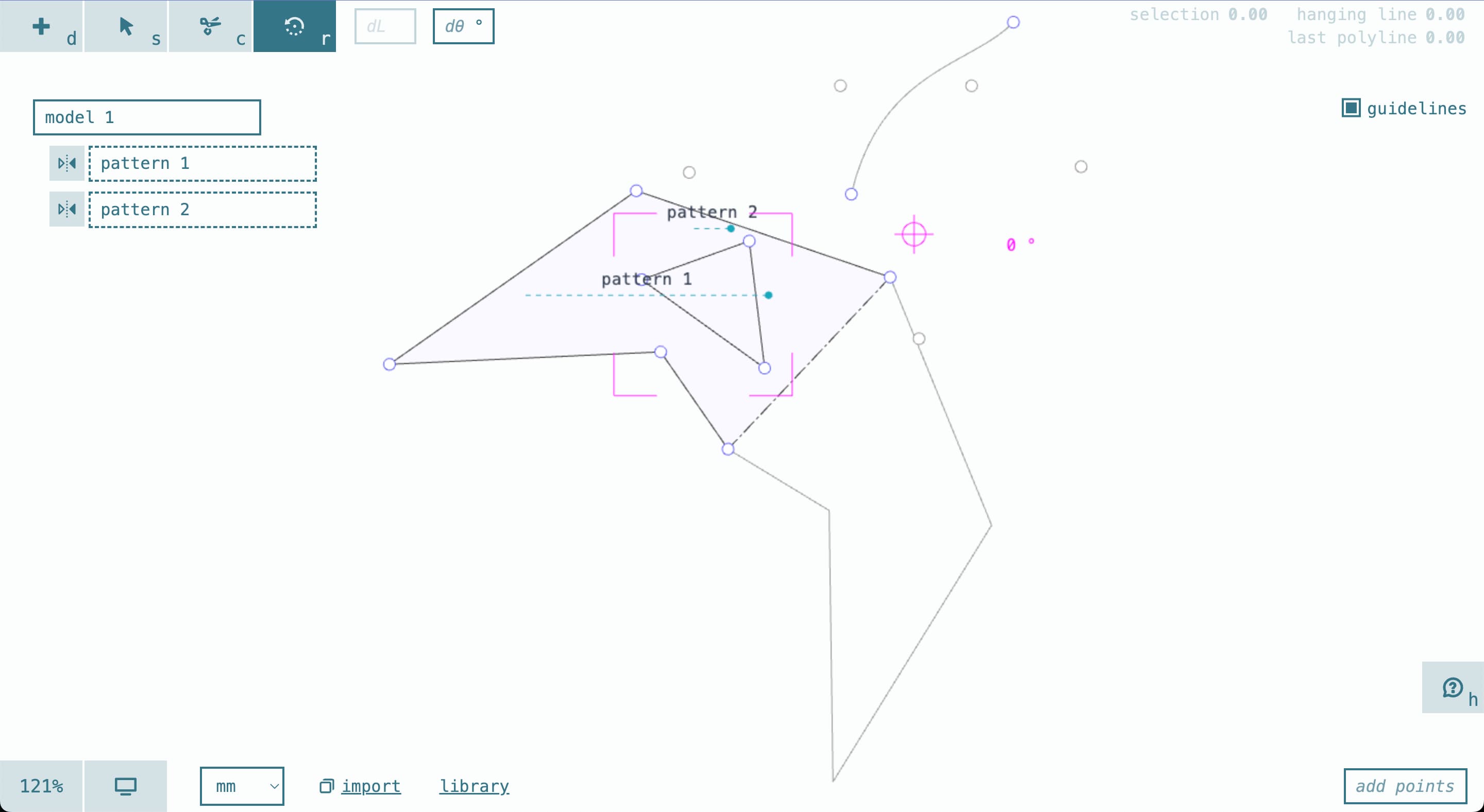
- Product
- The same job as the desktop CAD — drawing and editing garment patterns — rebuilt as a web app. Not an evolution of it: a different program.
- Complexity
- Performance in the browser, and a change of paradigm. The desktop way is select an element, then find a function in a menu.
- Made obvious
- Direct manipulation on the canvas instead. Buttons and menus almost disappear. A study of the UI states makes available only what you can actually use in the state you are in.
Speed Step PLM — UX audit
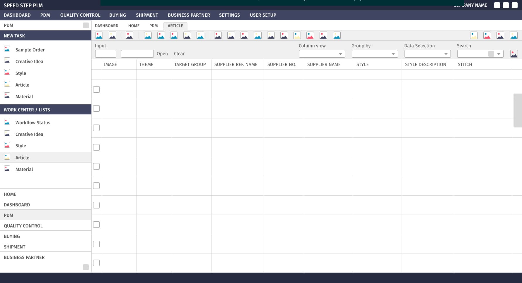
A UX audit of a PLM used from first idea to shipment, then a partial restyling.
2 images — scroll or use ← →
- Product
- The system that follows a garment from the first idea to the shipment: styles, materials, suppliers, quality control, orders.
- Complexity
- Understanding what it did. A small team, no documentation, customers scattered around the world, the office in Germany — and software you cannot use unless you already hold a mental model I did not have.
- Immersion
- Rebuilding that model from the software itself and from the few people who carried it in their heads.
I make an ecommerce sell
A shop is a funnel with a product at the end of it. Most of the money is lost in the steps nobody looks at.
Glowal — made-to-measure skincare
Conversion from 0.30% to 2%. From €2,000 to €200,000 in a year.
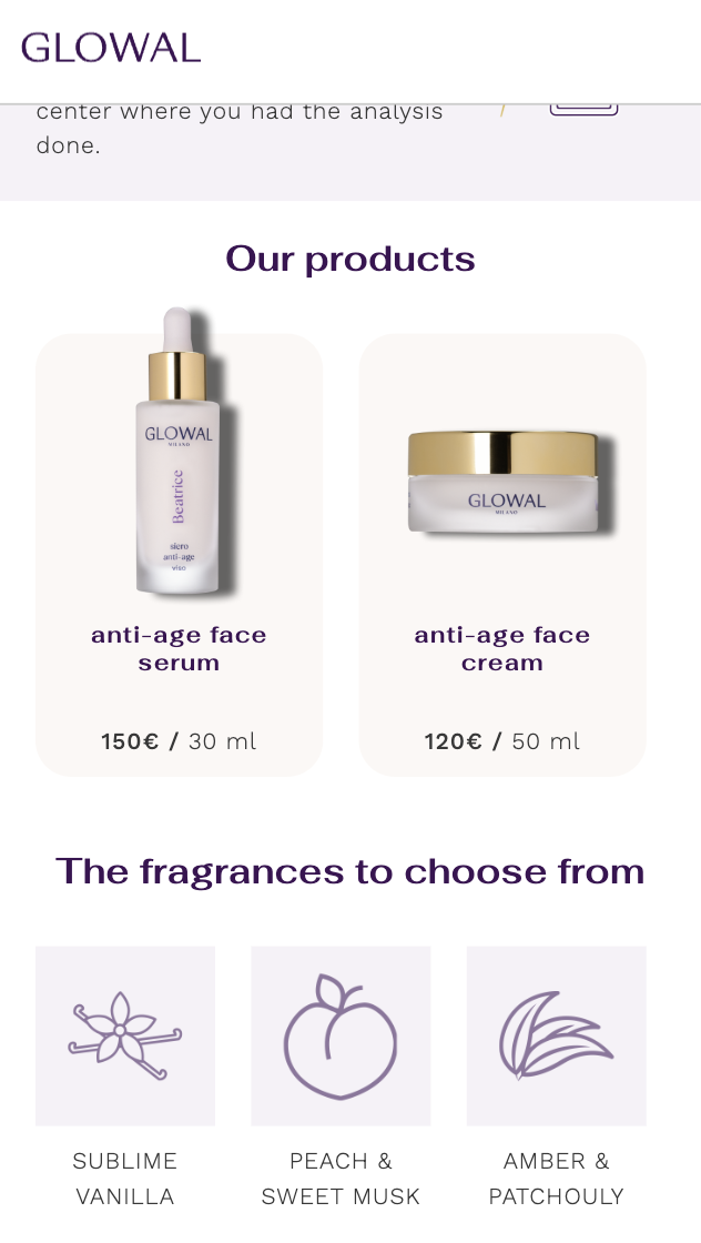
5 images — scroll or use ← →
- Product
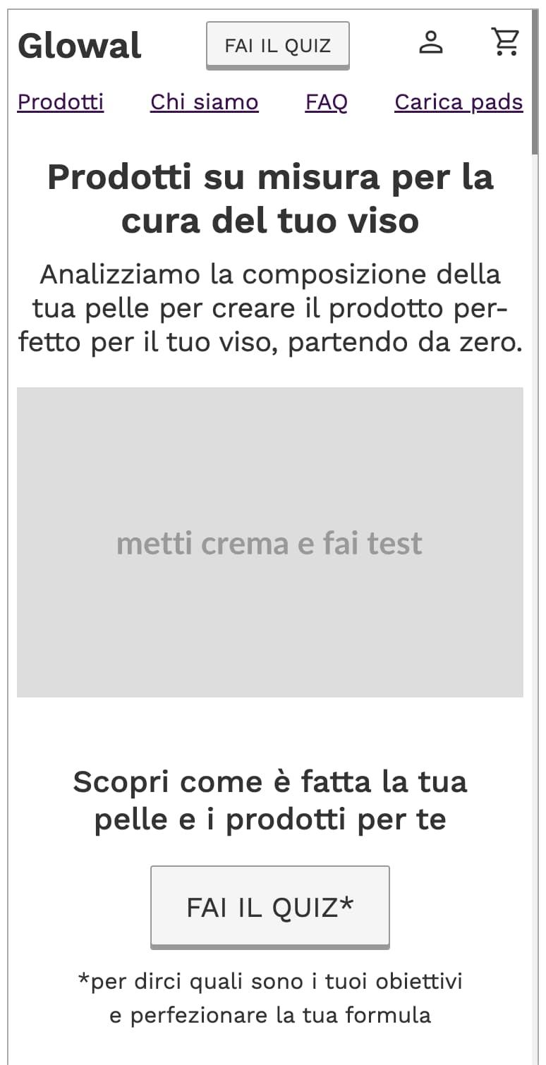
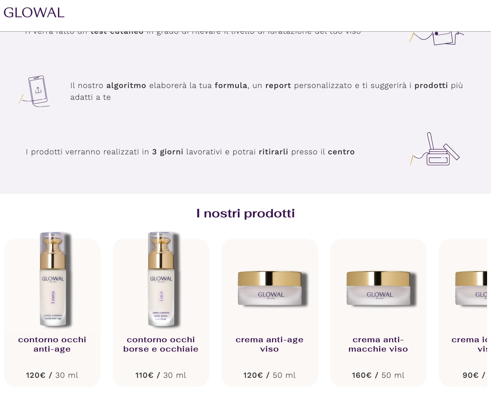
- A skincare startup that formulates a cream for your face. A quiz and a skin reading decide the formula; the products are made in three days.
- Complexity
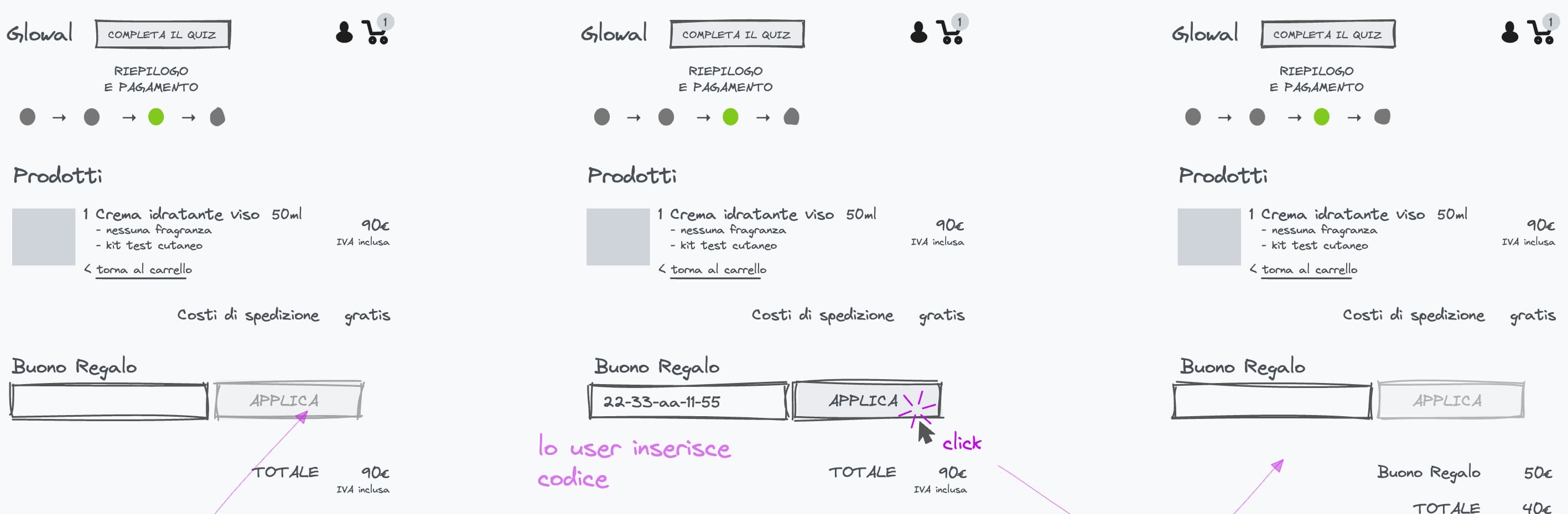
- The funnel. In the original version you took the quiz, waited for a swab to arrive by post, sent back a photo of it, and only then could you buy. It did not work.
- Immersion
- I studied the product and how it is customised, the whole flow, and the numbers from the first six months — the site was already live when I arrived.
- Made obvious
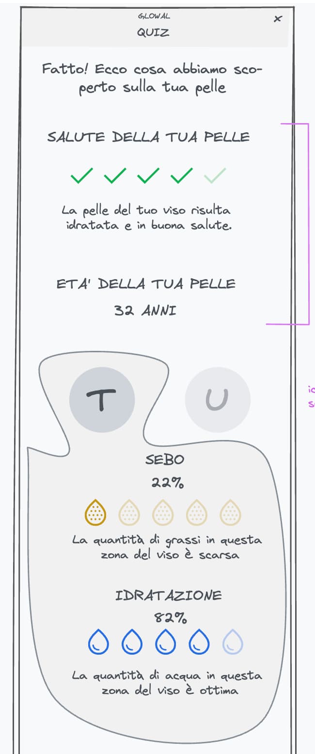
- The quiz and the skin reading moved inside the site: nothing has to arrive in the post before you can buy. The result screen shows what was found, zone by zone, so the formula is explained rather than asserted.
- Result
- €2,000 in the first six months on the original site. €200,000 in the twelve months after the redesign. Ecommerce conversion rate from 0.30% to 2%.
Pronto800 — toll-free numbers online
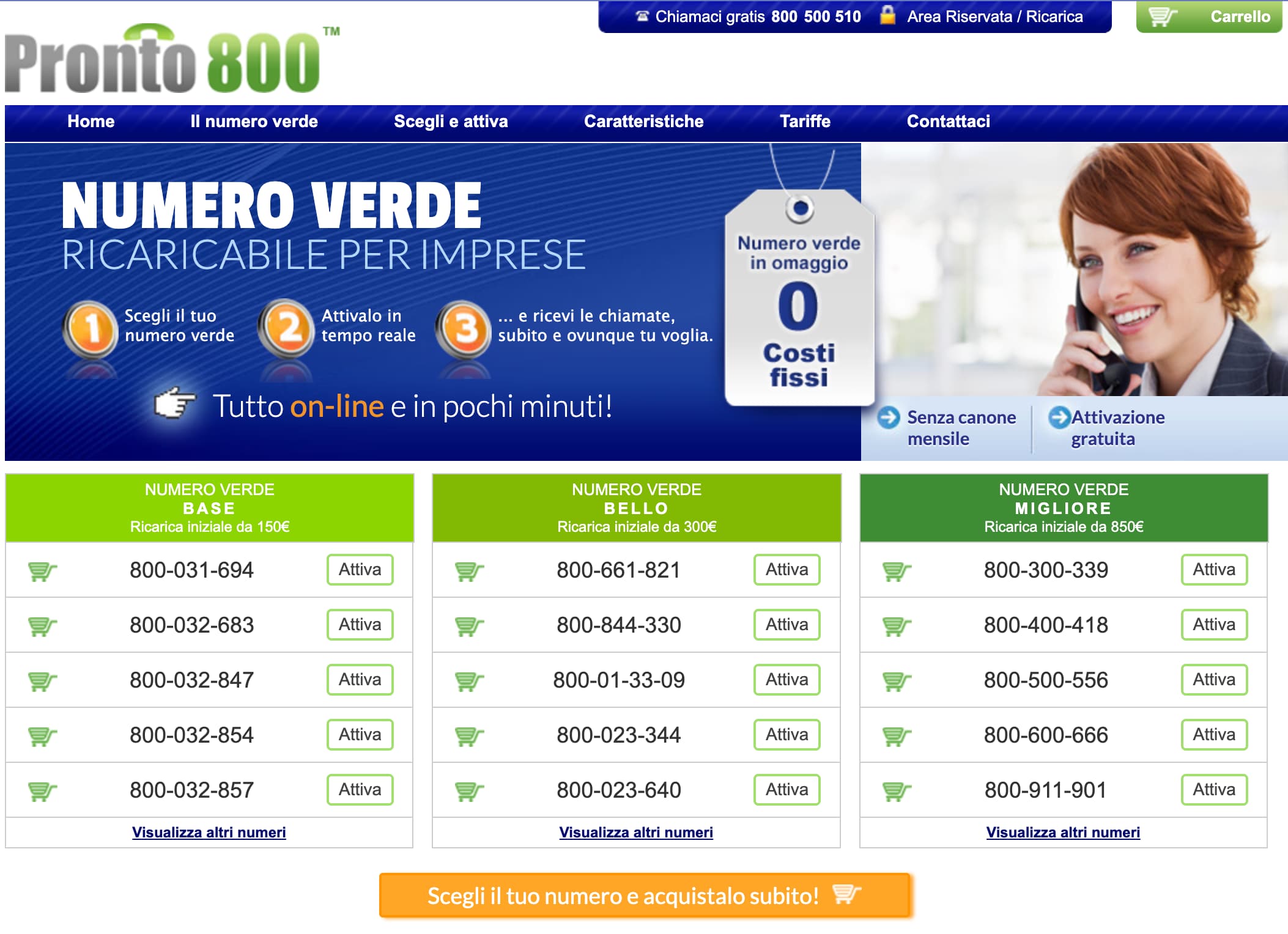
New customers from 30 to 60 a month, monthly value from €11,400 to €31,200.
- Product
- Toll-free numbers for small businesses: pick your number from a list, activate it online, start taking calls.
- Complexity
- Selling a phone number like a product on a shelf — three price tiers, a list to choose from, activation in minutes. The first ecommerce site I designed.
- Immersion
- I was the marketing lead, so I designed a page and then watched what it did to the numbers, month after month, for two years.
- Result
- New customers went from 30 to 60 a month. Average customer value from €380 to €520. Monthly value generated from €11,400 to €31,200.
Time to Detox — detox diet delivered
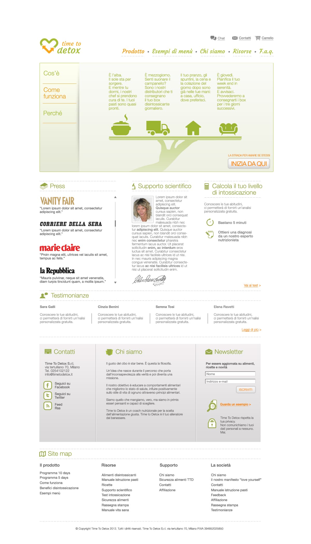
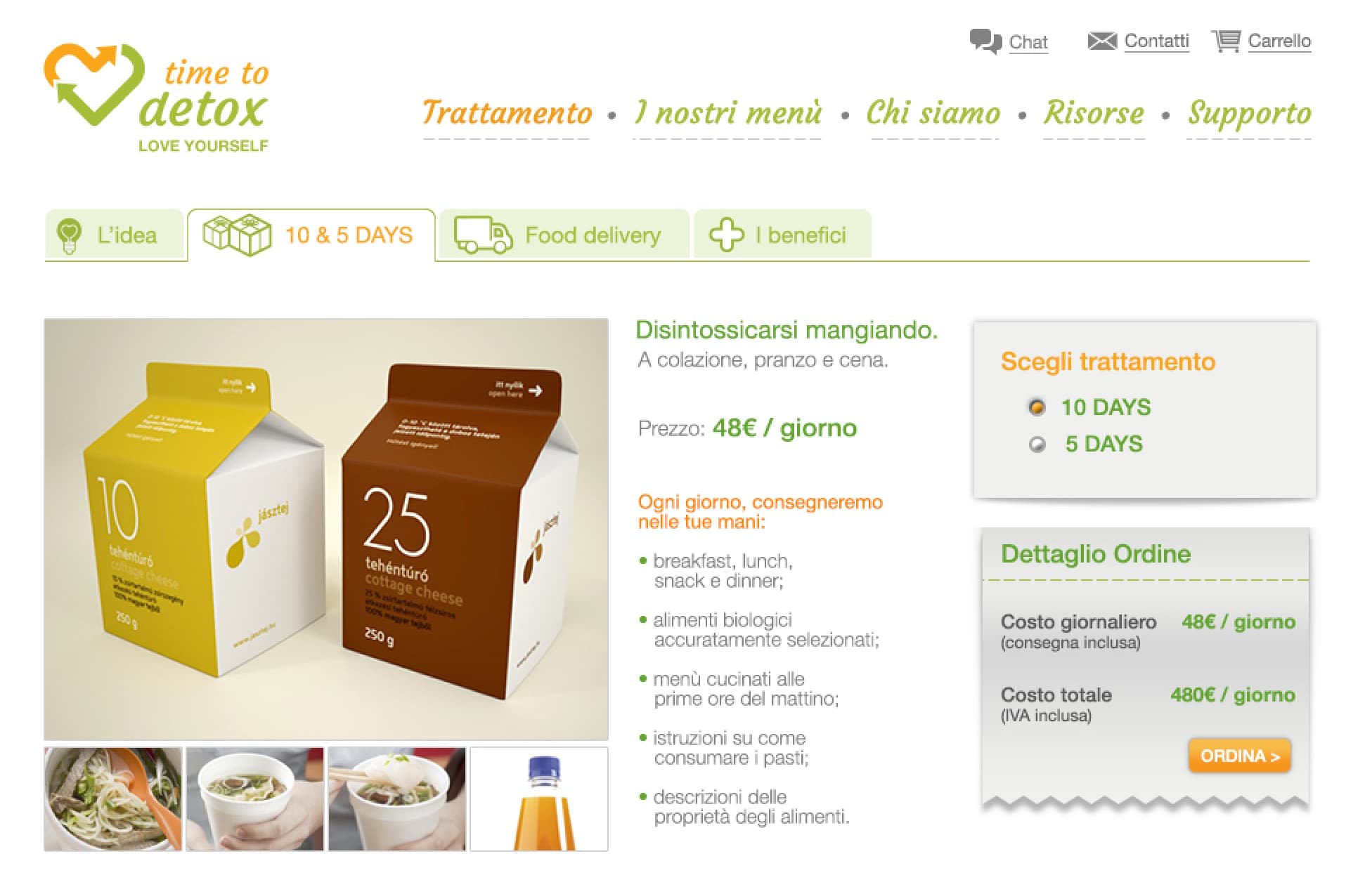
A whole diet delivered, sold as one thing instead of a catalogue.
2 images — scroll or use ← →
- Product
- A detox diet delivered to your door: breakfast, lunch, snack and dinner for ten or five days, €48 a day.
- Complexity
- Understanding the product. A detox diet is not self-explanatory — what it is, what it does for you, why it costs that. Saying it well is the conversion problem. The second ecommerce site I ever designed.
Ciao Gusto — Italian food for the UK
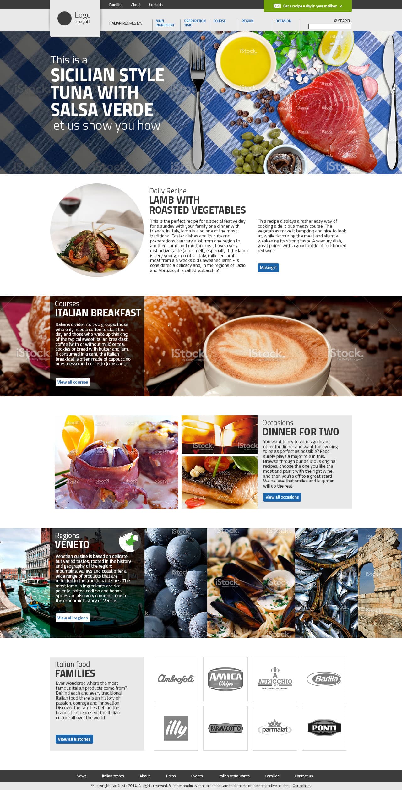
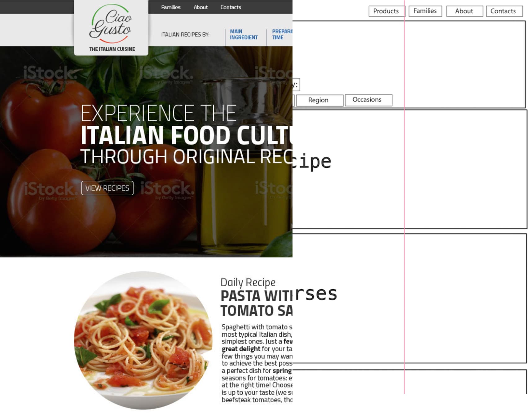
The recipe is the centre of the site, not the catalogue.
2 images — scroll or use ← →
- Product
- Italian food for the UK market. The site sells nothing itself: it makes you want an ingredient and sends you to the partner shops that stock it.
- Complexity
- A content site judged on someone else's sales. It has to build the desire and then hand the customer over at the right moment.
- Made obvious
- The recipe is the centre of the site, not the catalogue. Brands are reached through "Italian food families" — the histories behind them — instead of a category tree. That is also what set it apart from the competition.
I simplify the human-computer conversation
When the user is anyone — a hotel guest, a customer in a hurry, a developer mid-debug — the interface has one chance to be understood. No manual, no second attempt.
Egro One Touch — self-service coffee machine
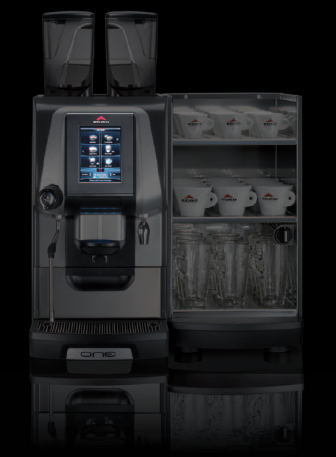
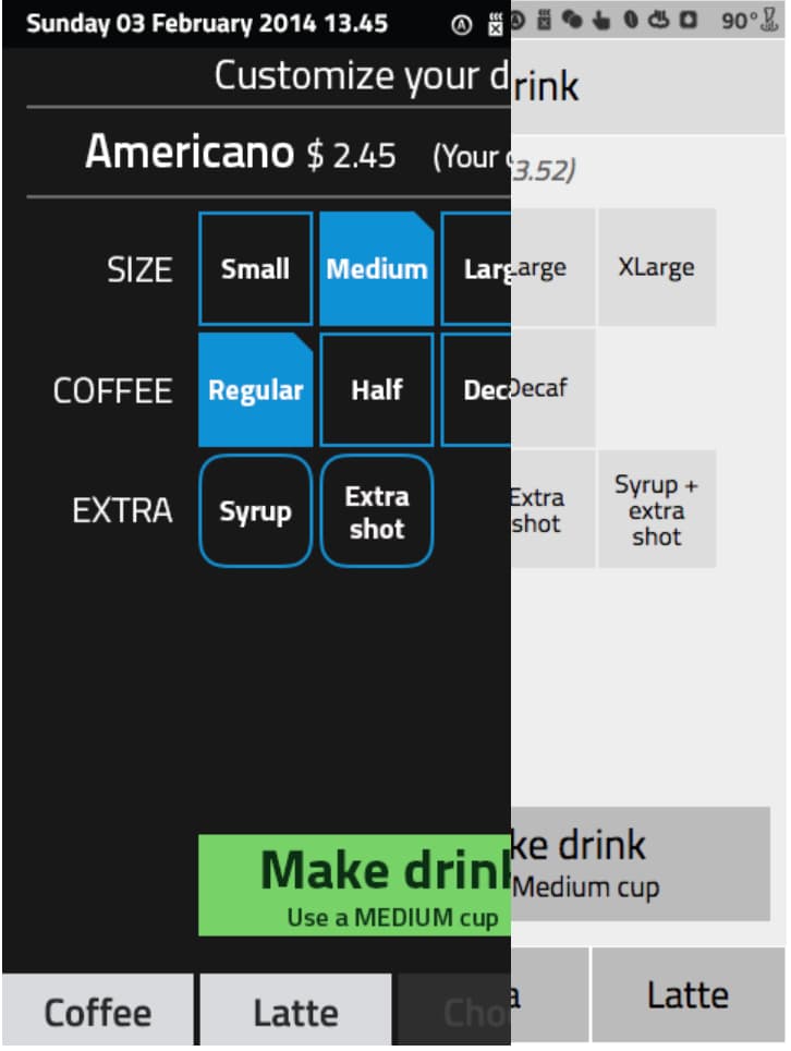
One decision per screen, no back button. First installed in Chicago, 2015.
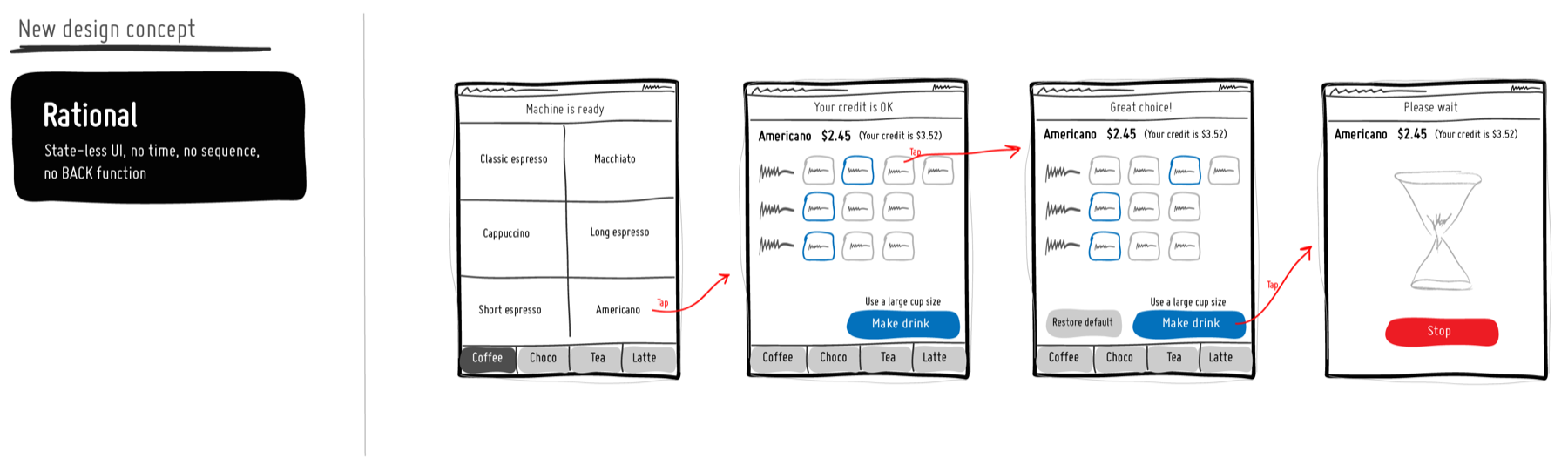
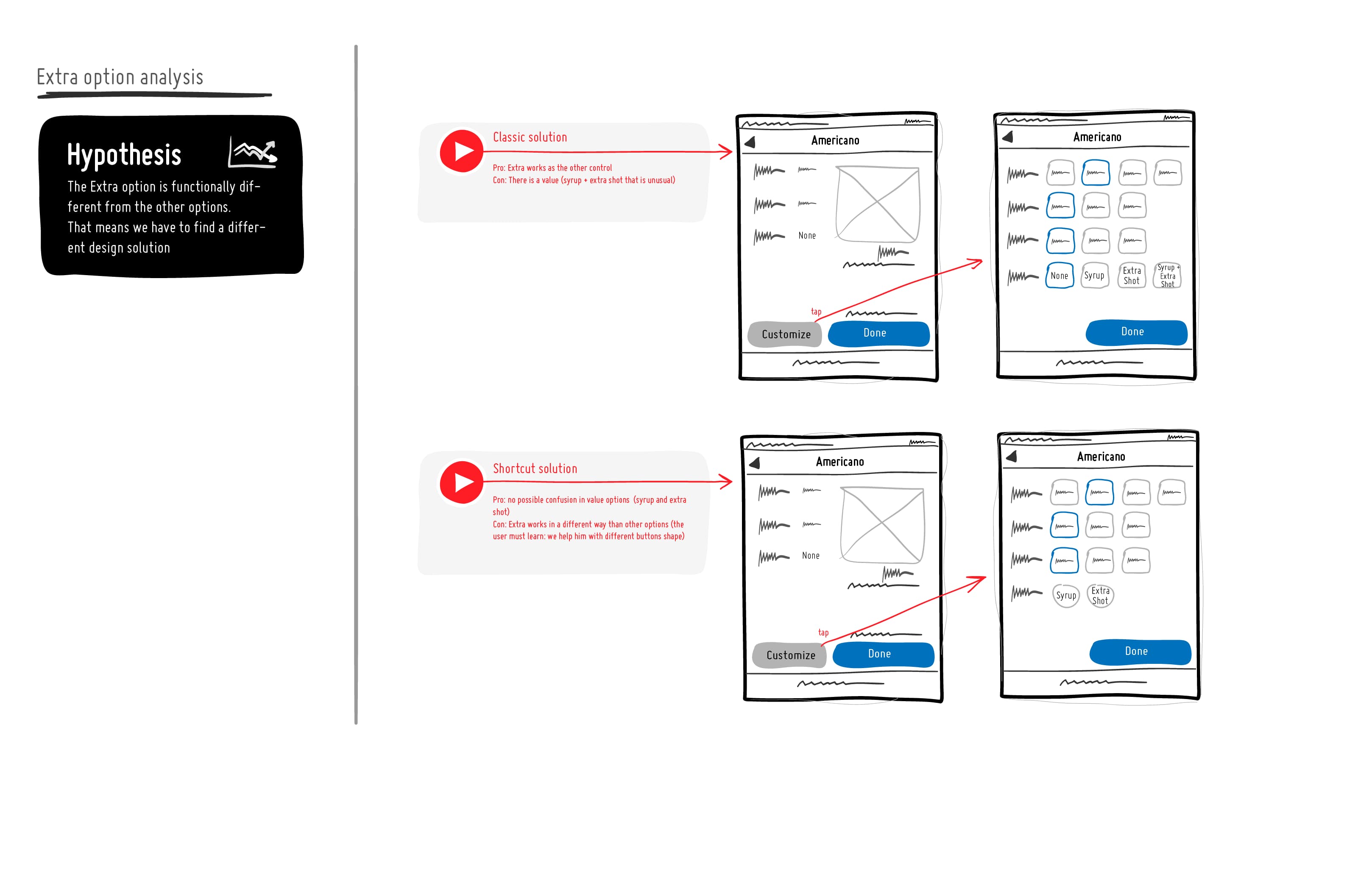
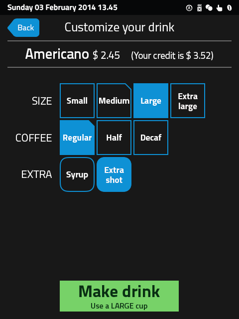
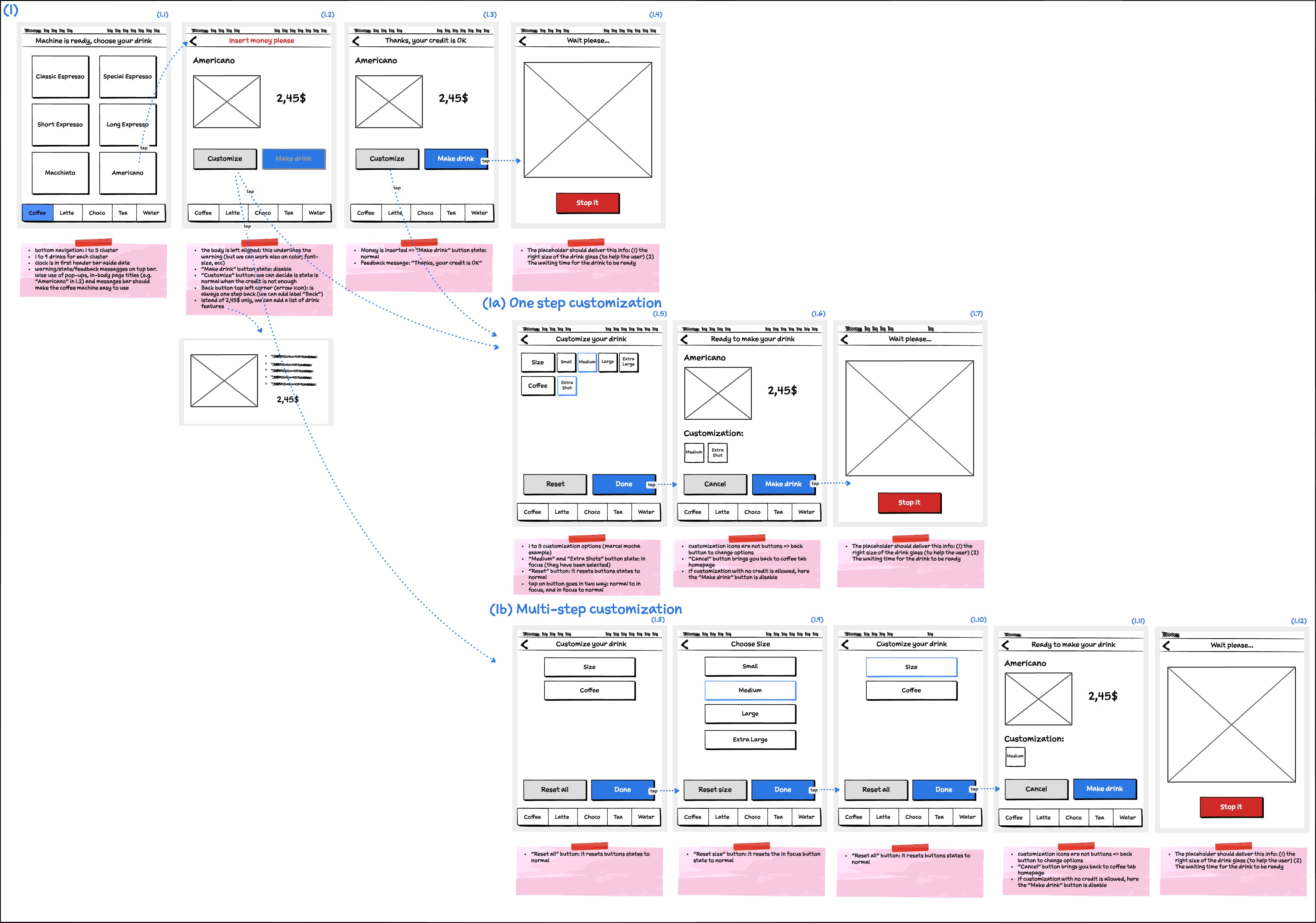
6 images — scroll or use ← →
- Product
- Coffee machine for hotels and bars: about 20 drinks, customisation, payment. Anyone, any language, no time to learn.
- Complexity
- Every drink has size, strength and extras; some combinations exist, some don't. Credit changes what you can order. All on a 7" screen.
- Immersion
- At least ten days at the plant next to the machine, running the flows on paper before touching pixels.
- Made obvious
- One decision per screen, no back button: a short linear flow you cannot get lost in. The "Make drink" button repeats the cup size, so nobody puts the wrong cup under the spout.
- Result
- Shipped. First machines installed in June 2015 at the Hyatt McCormick Place in Chicago.
Egro — second machine, larger screen
The cup is the interface: it fills with what you are about to drink.

- Product
- The next machine, one year later, with a bigger display and full drink customisation.
- Complexity
- More ingredients to adjust — foam, milk, coffee, size — and a customer who has to understand what they are changing.
- Immersion
- Second year with the same client and the same machines.
- Made obvious
- The cup is the interface: it fills with the actual ingredients as you adjust them. Not decoration — it shows what you are about to drink.
- Result
- In production.
Morgan analytics — production dashboard
Production and Efficiency always read together, then drill down.
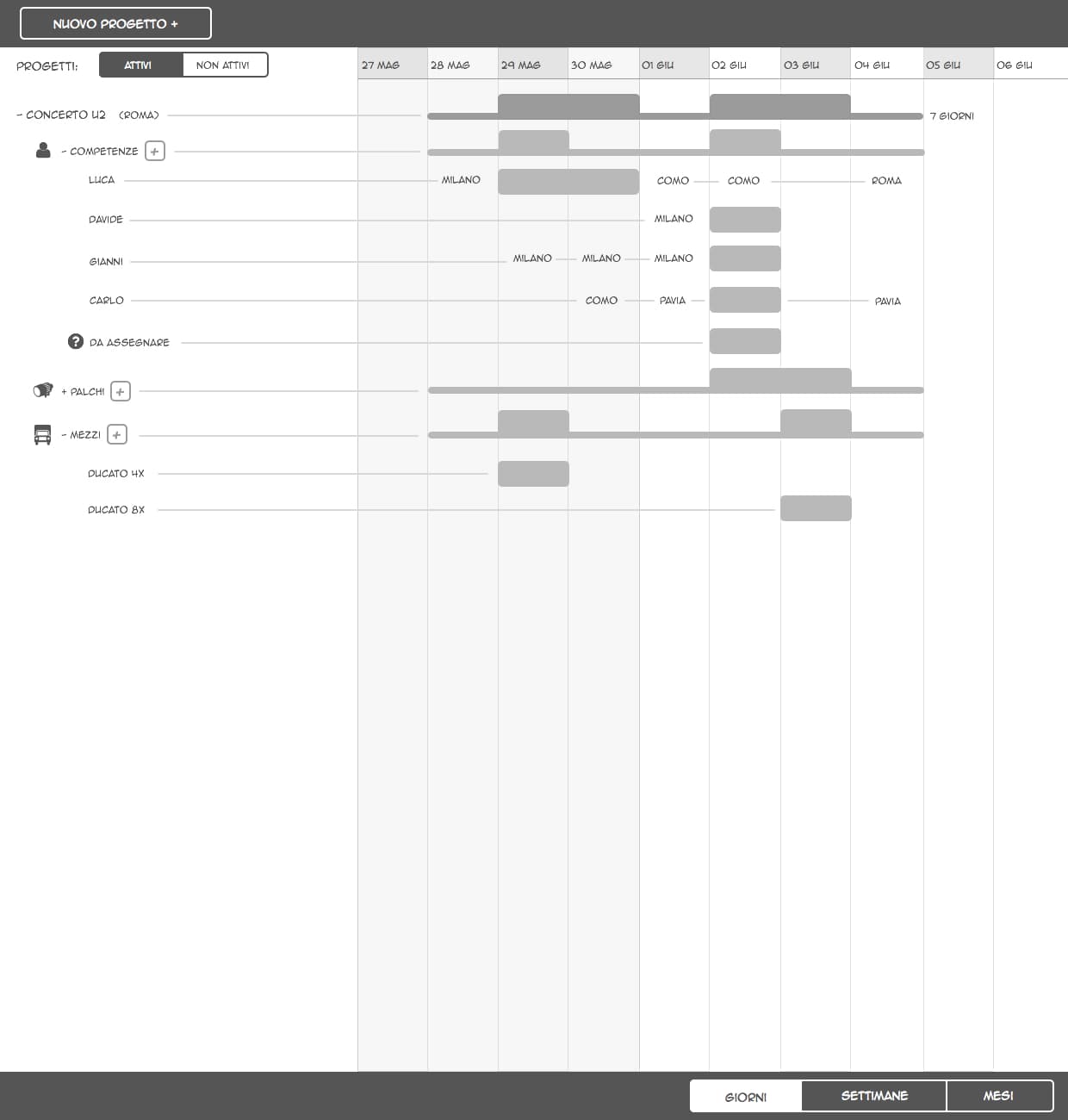
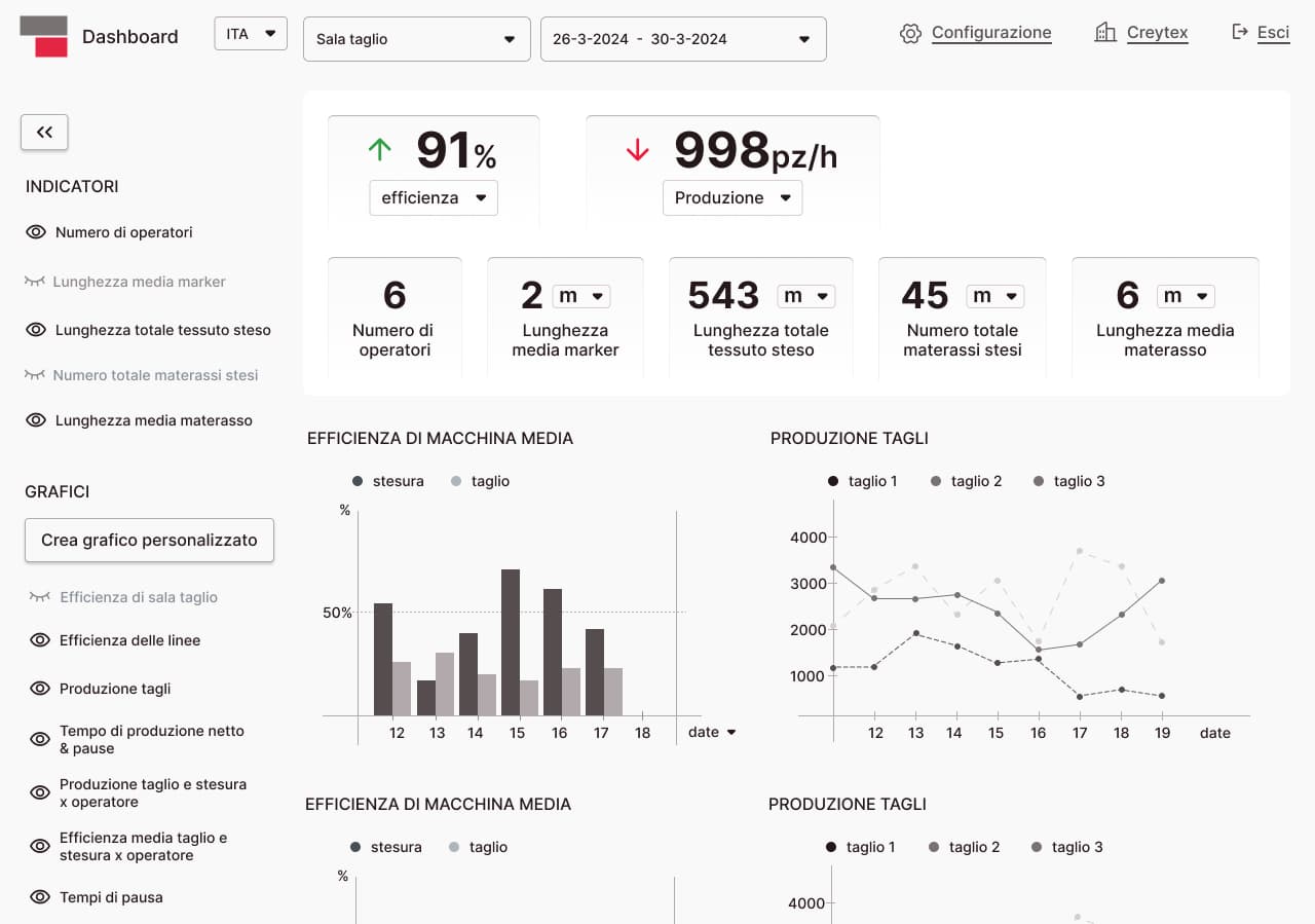
2 images — scroll or use ← →
- Product
- The production dashboard of a cutting room: efficiency, output, orders, one machine against another.
- Complexity
- A dashboard answers a question the reader has not finished asking. One number alone means nothing; all of them at once and nobody reads any.
- Made obvious
- Between the first version and the second the concept changed. Production and Efficiency are now always read together — either one alone misleads. And drill-down became the dominant pattern: you start from the overview and open the number that surprised you.
Firefox DevTools — adding a CSS property
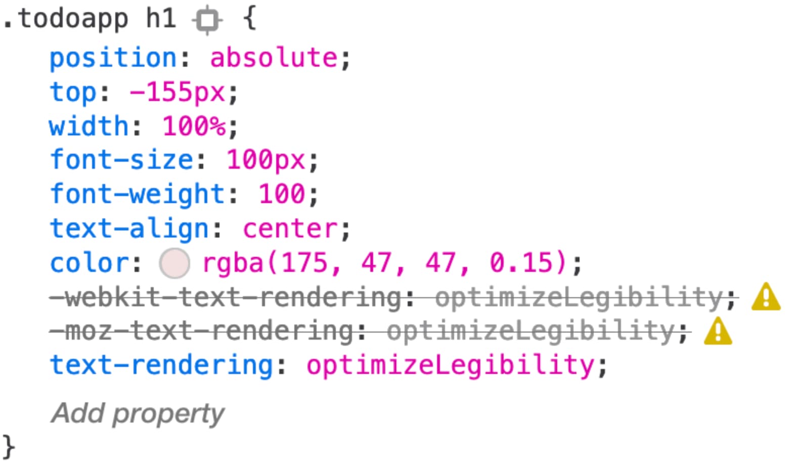
An “Add property” line where the action happens. The issue is still open.
- Product
- The Rules panel of the Firefox inspector, where developers read and edit CSS.
- Complexity
- You could already add a property by clicking an empty spot inside the rule. Nothing in the interface said so. A feature you have to be told about does not exist.
- Made obvious
- An "Add property" line at the end of the rule, appearing on hover: the affordance sits where the action happens, without adding permanent clutter.
- Result
- The issue is still open. The repository was archived in 2025.
Multi-room music on a wall panel
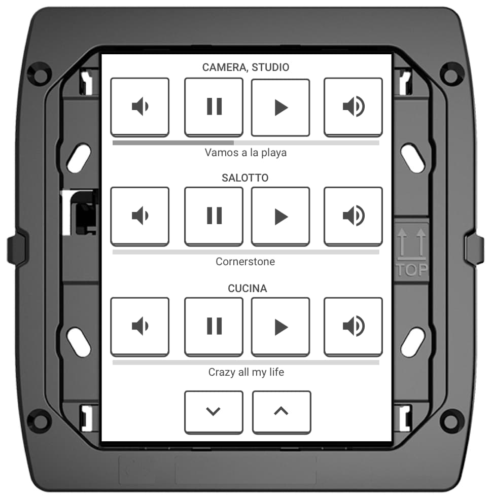
Took away what was rarely used, so pick a room, pick a track stayed easy.
- Product
- Multi-room audio on a home automation panel: pick a room, pick a track, play.
- Complexity
- A small screen, inside an existing home automation interface that already did many other things, with all the technical constraints that came with it.
- Made obvious
- I took away what was rarely used, so that the essential thing — choose a room, choose a track, listen — became easy.
Piano Link — learning piano together
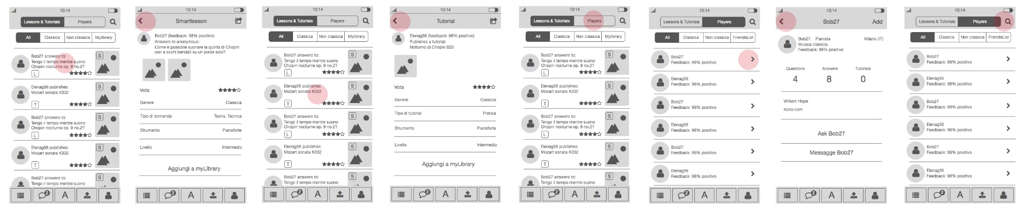
Wireframes delivered; I never found out what happened to it.
- Product
- An app for piano students: lessons, tutorials, and questions answered by other players, each carrying a public feedback score.
- Complexity
- Non-trivial flows and a lot of features, a tight deadline, and no field work — wireframes drawn directly with the founder.
- Result
- I delivered the wireframes and never found out what happened to it.
I find what's wrong with interfaces
Before redesigning anything, find out what is actually broken — and prove it, rather than assert it.
Poinx — couponing ecommerce
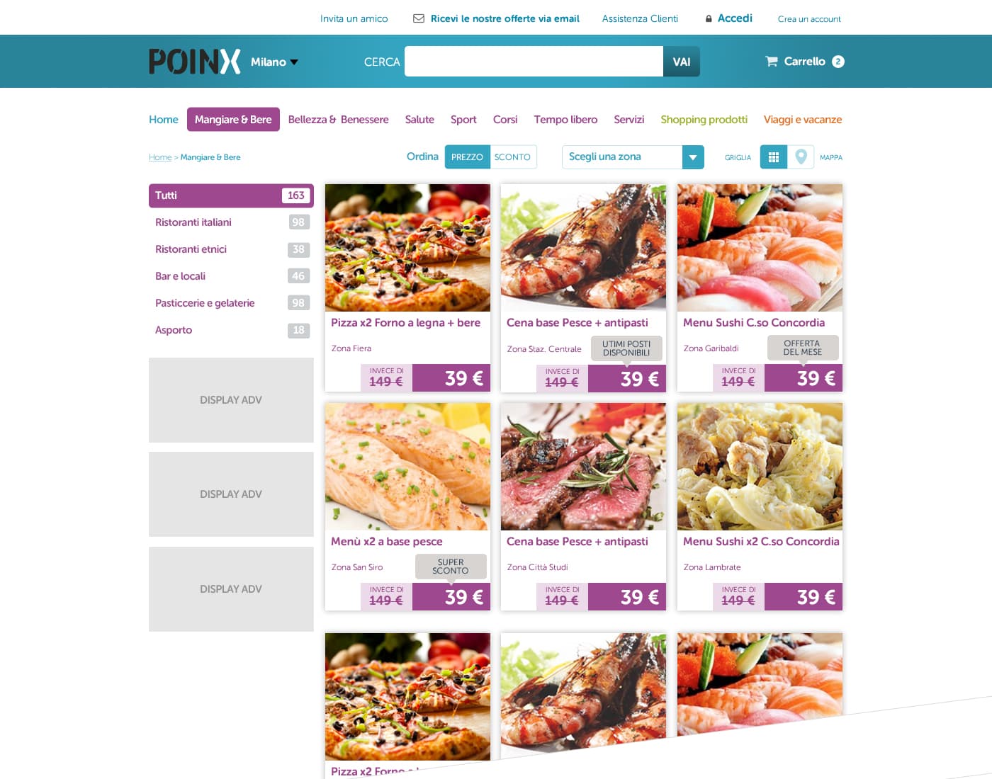
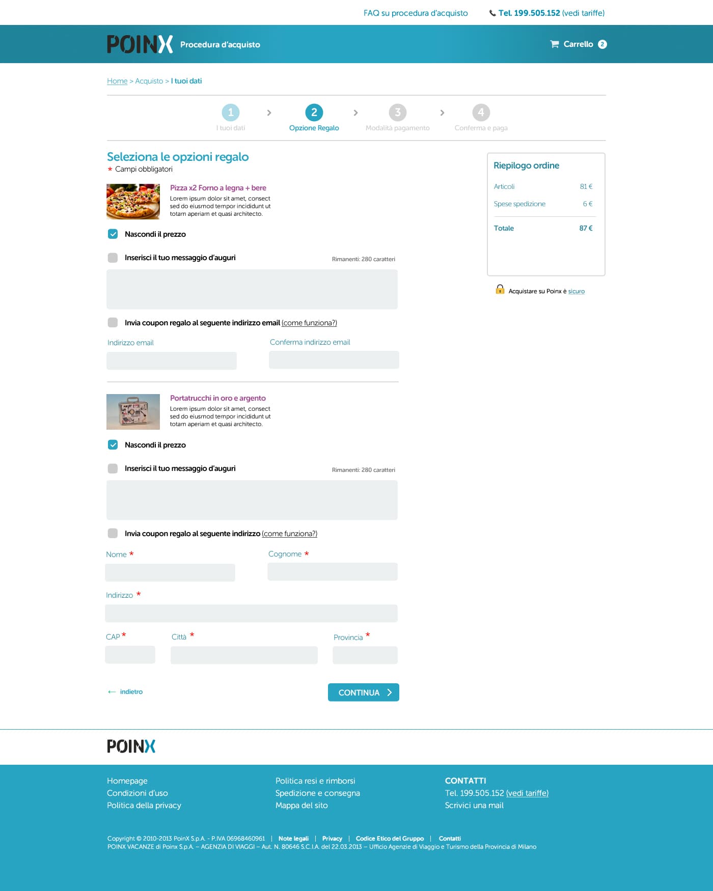
Labels from card sorting, a cart, and guest checkout — new in Italy then.
2 images — scroll or use ← →
- Product
- Couponing ecommerce: deals on restaurants, treatments, courses, trips.
- Complexity
- Information architecture. People could not find the deal they wanted, because deals were not grouped the way people expect. On top of that: filters, an L-shaped navigation, and no cart at all — you could not buy two coupons together.
- Immersion
- A lot of card sorting, to find out which semantic group people expected a given deal to live in. Then the Baymard Institute checkout guidelines for the purchase flow.
- Made obvious
- Groups and labels taken from the card sorting, not from the company's internal categories — the labels got a disproportionate share of my attention. A cart. And guest checkout, new for the Italian market at the time.
- Result
- The team considered guest checkout a success, though I have no number for it. The site no longer exists.
I build my own tools
Things I built because I wanted them to exist. Some worked, some did not; the honest version of both is below.
Review my code
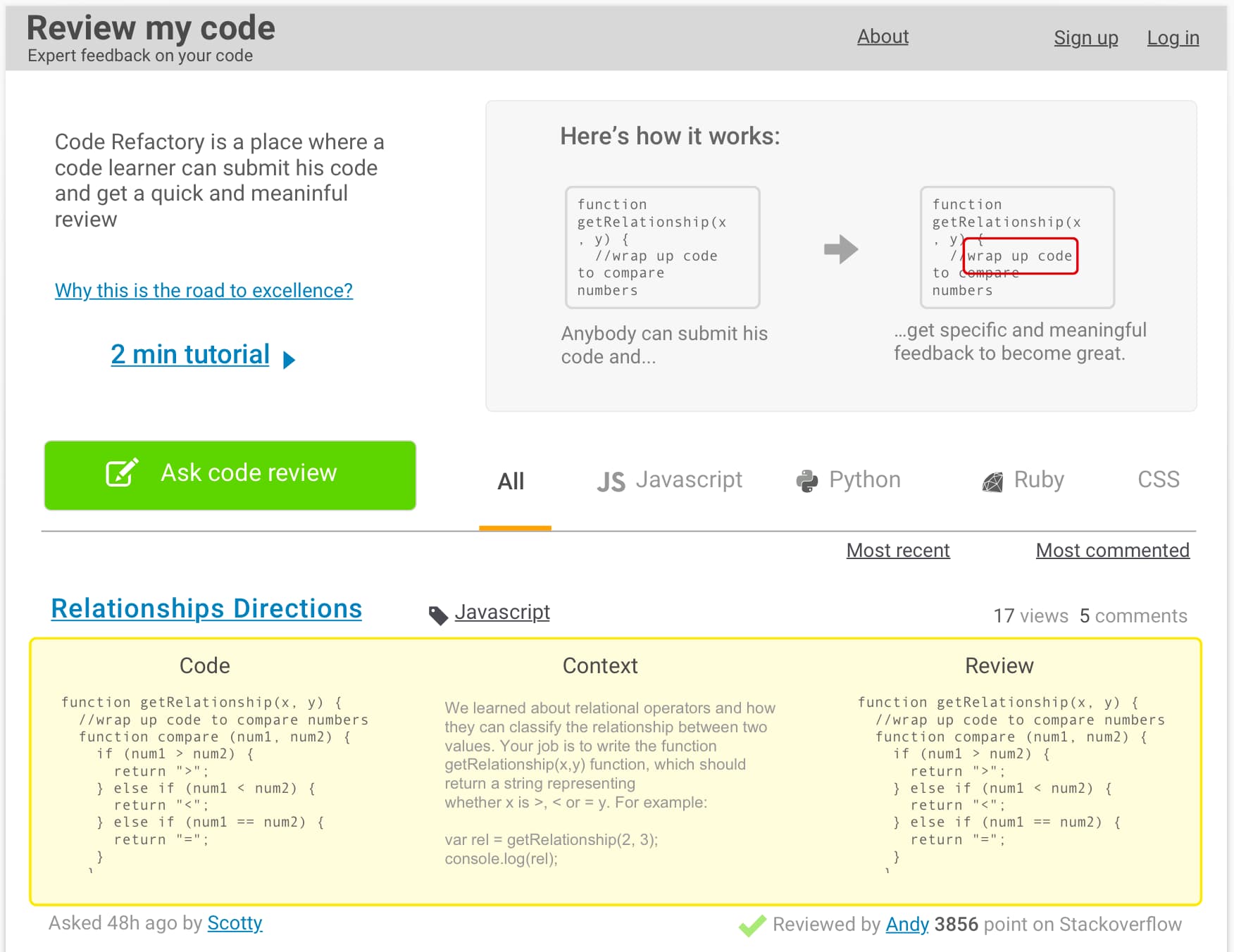
Juniors post their code, seniors review it for real. Designed and prototyped.
- Product
- A place where someone learning to code posts their code and gets a real review from someone senior.
- Complexity
- A review is only useful if it is specific. The interface has to hold three things at once: the code, the context the learner was given, and what the reviewer would have written.
- Immersion
- Built while I was studying at Bloc, a school in San Francisco. We made it for ourselves, then gave it to Bloc.
Annotando — a notepad with zero features
Nothing to learn: no document model, no formatting, no settings.
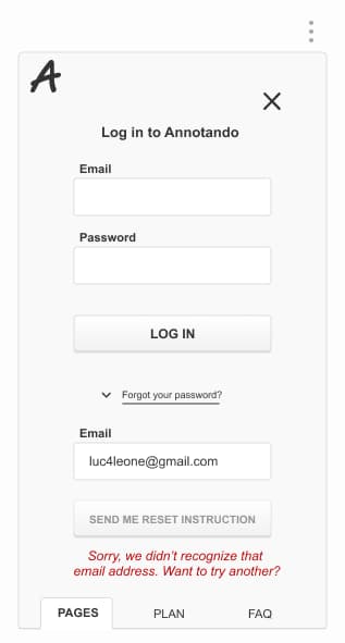
- Product
- A Windows Notepad for the web. You open it and you write. It works offline.
- Complexity
- Nobody would sell an app with literally zero features, so nobody builds one. That is the gap: every writing app I tried puts something between me and the sentence.
- Made obvious
- Nothing to learn. No document model, no formatting, no settings to visit first.
- Result
- I stopped using it and I miss it. I will probably bring it back.
To-read list
One flat list you work through, not a library you curate.
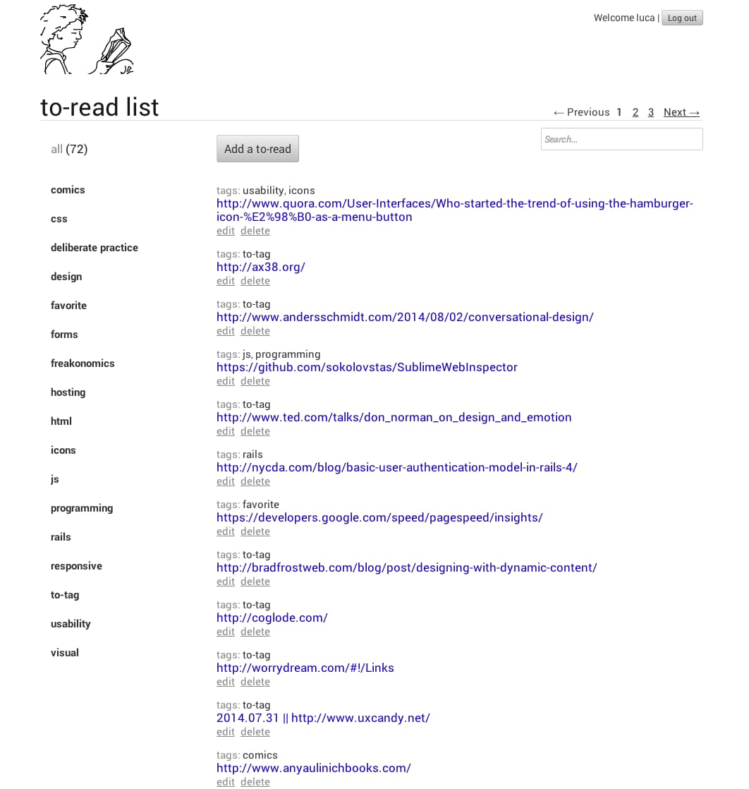
- Product
- A place to save web addresses to read later — and actually find them again.
- Complexity
- Saving something to read later is not the same as saving something you love. Bookmarking apps are built for the second thing.
- Made obvious
- Tags, including a "to-tag" tag for whatever you have not sorted yet, and one flat list you work through — not a library you curate.
- Result
- I used it for a while, then stopped. The prototype is gone.
Calcioclip — video analysis for football
We shipped v1 and could not sell it. After a year we stopped.
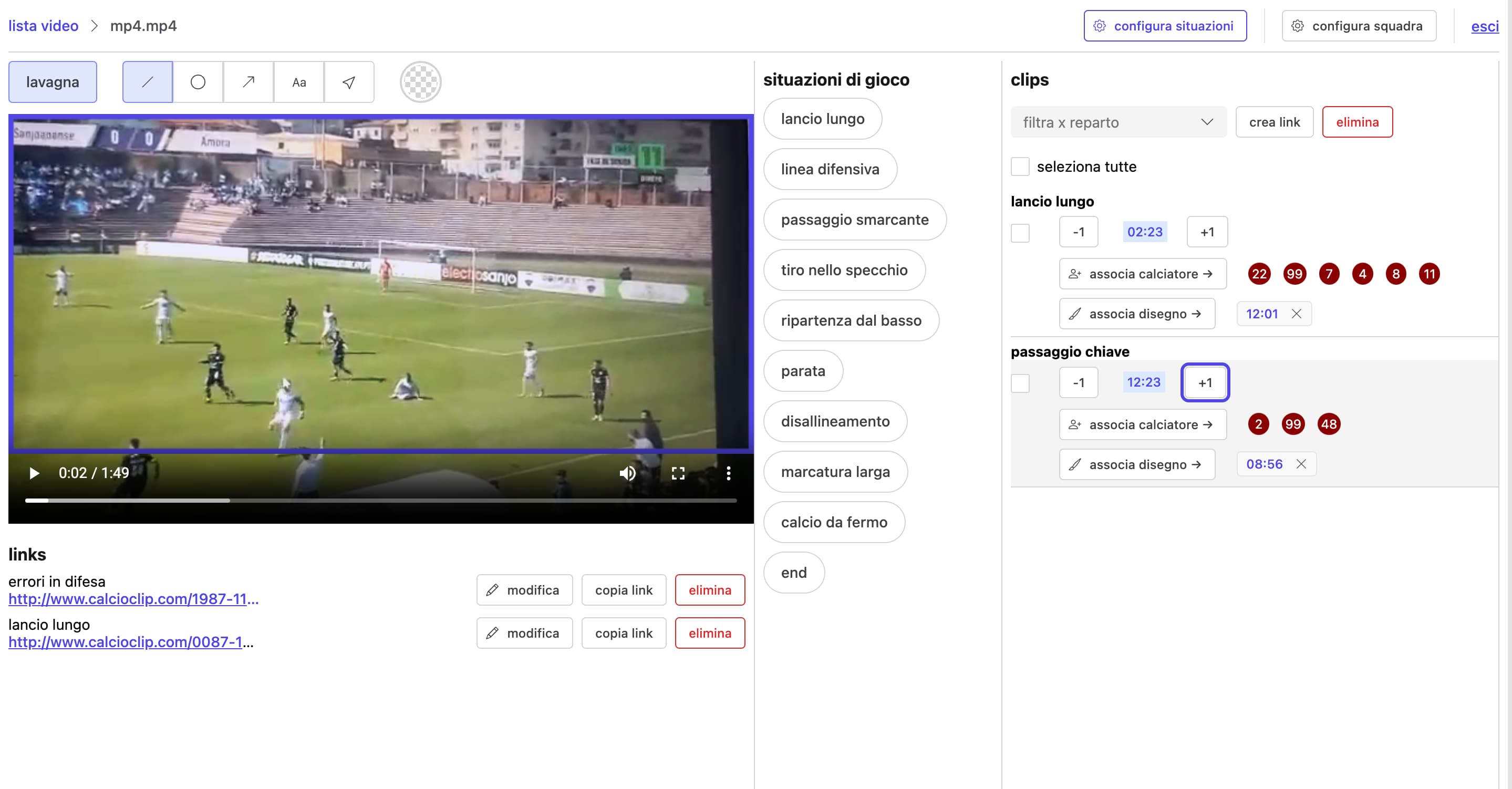
- Product
- Video analysis for coaches: tag what happens in a clip — long ball, defensive line, key pass — link it to the players involved, send it back as a lesson. Also useful for scouting.
- Complexity
- A coach is not going to learn an editing tool. Tagging a moment, attaching the right players and sharing it has to take seconds, between one session and the next.
- Result
- We shipped v1 and could not sell it. After a year we stopped.